A local photographer has created a time-lapse video from a series of 3000 photos taken by walking down the Green Line (Central Corridor) tracks from Saint Paul to the junction with the Blue Line (Hiawatha Line) in Minneapolis near the Metrodome—a distance of about 9.5 miles. (Yes, the Central Corridor project is often said to be 11 miles long, but that includes the already-existing track from the Metrodome to Target Field.)
A Time-lapse Tour of St. Paul's Green Line from cynick on Vimeo.
Wednesday, December 11, 2013
Saturday, October 26, 2013
Density and the transit puzzle
How would you choose a route for a transit line? It's a difficult task, particularly in a region as big as the Twin Cities. Developed land stretches out for miles and miles before finally tapering off into farmland or patches of wilderness. Some parts of the region have natural geographic constraints due to rivers and lakes, while other places get blocked off due to human activity: buildings, highways, and railroad lines to name a few. Opportunities for perfectly straight routes often aren't as common as we wish. Even though the core cities and some older suburbs have substantial chunks of street grids, there are inevitably points where the block size shifts or entire pieces get rotated. In particular, areas near the downtowns of Minneapolis and Saint Paul were set up to follow the riverbanks rather than east-west/north-south lines. Those areas still tend to have small blocks and many opportunities for routing buses or rail vehicles—perhaps too many in some cases.
The street grid itself can be an impediment sometimes, increasing travel distance by nearly 30 percent in the worst case (if a straight line between your origin and destination is angled at 45 degrees against the grid). But still, a dense grid offers lots opportunities for getting between places, and allows for good walkability—it's often not a big deal if a bus or rail line misses pockets of density by a couple of blocks, because they can still be easily accessed on foot. Depending on their shape and size, it's not hard to walk 4-8 blocks on either end of a transit trip—or even double that. But when you go into an area where the grid fades away, it becomes much more critical to precisely locate transit stops and stations at cross streets or other locations (such as near bike/ped pathways) that maximize the number of different ways for people to access stations.
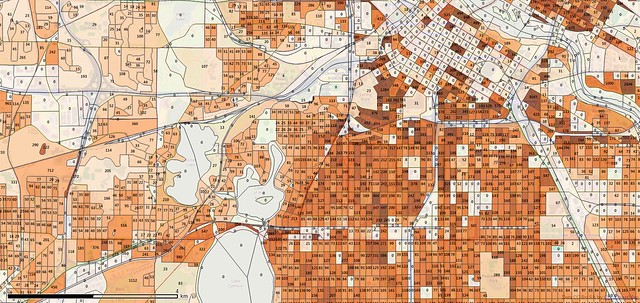
Of course, maps merely showing population density don't tell the whole story. Large chunks of downtown Minneapolis don't have any residents, for instance, but there are skyscrapers rising nearly 60 stories high. Clearly there's something there: office buildings. Some are dedicated to major companies, but the buildings are generally renting out space to many different tenants. Residential buildings are mostly excluded from the core of downtown, which is why some areas can feel dead on weekends and evenings. There are high-rises not too far away, but the daytime population of downtown remains dominated by employees who live somewhere else.
It can also be important to show where the boundaries of each region of population are. In sprawling suburbs, the data you try to use in order to make decisions becomes much more sparse. Individual blocks are larger, sometimes huge. Public streets are few and far between, with individual properties connected and yet separated by private drives and parking lots, and bounded by landscaping features such as ditches, creeks, ponds, bushes, and trees.
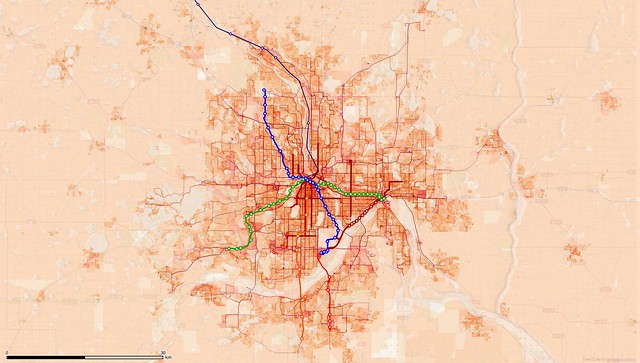
So, overlaying employment data can help. Unfortunately, it usually isn't available at very good resolution. For my first and third map in this post, I used Transportation Analysis Zone employment information from the MetroGIS DataFinder service overlaid on top of block-level population data from the U.S. Census Bureau. The second and fourth map only show population data (population count per block as a number, density for the color). All of the maps were created using the open-source tool, QGIS. The first and third map also include bus lines and proposed transit corridors (LRT for Blue and Green Lines, and BRT for the Red and Orange Lines).
Frustratingly, a number of corridors were not included because of a lack of easily-accessible data. The Gateway Corridor is still being nailed down, and was not represented in the DataFinder shapefiles. Even the Bottineau corridor wasn't included, so I added that. "Arterial BRT" and potential streetcar corridors weren't included either, though I did add station objects along Route 54 which is the highest-frequency limited-stop bus route in the Metro Transit system. Other "HiFrequency" lines are shown solid, because they have stops every 1-2 blocks in most cases. The precise routing and stop locations for planned routes are also in flux, so these maps will need to be revisited.
Each TAZ is usually composed of multiple census blocks, so overlaying the two can have some strange effects (I believe the appearance of heavy density northeast of University and Snelling is largely due to employment at the Griggs-Midway building by Fairview melding into an area that's mostly residential, for instance). There also seems to be missing data in a few cases, particularly on the employment side (the University of Minnesota has a lot of employees, though the East Bank campus is seemingly empty). The maps are not the One True Way to see the world.
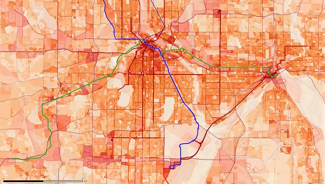
Still, it's pretty remarkable that we're currently planning to build LRT out to an area with population dispersed like we see above, and with such a sparse street network, when projects to connect denser areas get discarded or downgraded. The number of people per census block is actually relatively high in Eden Prairie, often measured in the hundreds, but it's difficult to move around in the area because of such a stingy layout of roadways, often lacking sidewalks (this map is at the same scale as the second one in this post which focused on south Minneapolis). Looking at aerial photos, the region seems to be bustling with activity, but a lot of that is due to low-slung office and retail buildings with massive parking lots. All the asphalt makes it look more built-up than it is.
The city also has a big employment base—more people work in Eden Prairie than live there. But despite that large number of workers, the employment density isn't all that high. There may be some missing data from employers who declined to submit per-site numbers, but it appears we'd have a much better return if we looked at improving the situation along the I-494 strip and the France Ave/York Ave corridor in Bloomington, Edina, and Richfield, for instance.
But looking at our existing Hiawatha Line seems to show that rules that you think are important can be broken and still result in something that gets broad appeal: There's very little residential density along the east side of Hiawatha Avenue, because it has been and continues to be used as a freight rail corridor for industry (mostly grain traffic). The airport and Mall of America are also critical to the line's success, but they're in areas which are otherwise pretty empty. The Central Corridor also neighbors large areas without any residential use—though that line tends to skip over the "empty" space while other routes seem to skip the populated areas.
The region is certainly running an interesting set of experiments with these routes, as well as some of the others that I couldn't get to. Which ones will turn out the best?
Friday, October 18, 2013
Japanese Shinkansen documentary
Richard Hammond hosts an episode of Engineering Connections which looks at some of the engineering challenges faced by developers of the Japanese Shinkansen high-speed rail system.
Friday, October 11, 2013
Amtrak versus the shutdown
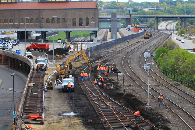
A rail crew replaces a switch on October 4th in preparation for reconnecting the Saint Paul Union Depot to allow Amtrak service.
Amtrak, the National Passenger Railroad Corporation, could cease to be a "national" network if the federal government shutdown drags on. The company has said that it can ride out a short-term shutdown, on the order of "several weeks", but it's unclear what might happen beyond that point. The good news is that the company is in better financial health than they have been in a decade or more, somewhat extending the window of time they can operate without federal assistance. The bad news is that it would still be a extremely difficult task to find the $100 million or so per month they would need to keep running the company as it is today.
The federal shutdown has also come at an impeccably bad time for boosters of the Saint Paul Union Depot project. As you read this, work is progressing on finally connecting the station to mainline tracks in order to allow the Empire Builder to return to a downtown stop it hasn't visited since Amtrak was formed in 1971—the return may only be shortlived.
Of course, political figures have proposed zeroing out Amtrak funding numerous times over the years, or slicing it up into regional businesses, so some thought has been put into how the company might try to cling to life. Until now, at least, the railroad has always received enough support to keep limping along. There have been occasional bursts of greater investment, but never the sustained influx of cash that the company has needed to get a truly stable footing.
Probably the most popular idea has been for Amtrak to condense service down to the Northeast Corridor, the 453-mile D.C.–Philadelphia–New York–Boston line which accounts for more than a third of passenger traffic on the system, and about half of the revenue. That's because there are dozens of trains per day on the NEC, a frequency of service far higher than anywhere else (most of Amtrak's overall route mileage only has one or two trains per direction per day). The NEC is where Amtrak most consistently turns a profit against operating expenses, though that doesn't necessarily cover the costs needed to maintain and upgrade the rails and power systems (for instance, much of the line uses an antiquated 25Hz power supply, unlike the 60Hz power used throughout the rest of the country, and it will cost billions to fix).
Shrinking down to just the NEC, or the NEC plus a few branch routes, probably wouldn't be necessary. Under the Passenger Rail Investment and Improvement Act of 2008, states must take over as primary funders of routes under 750 miles in length. States had until October 1st of this year to negotiate contracts, with October 16th (next Wednesday) set as the service cutoff date. Three states were still in talks at last count. So those routes (roughly 30 across the country) would probably still be able to operate going forward—but those are regional routes which would still become isolated from each other in many cases.
Most at risk are the long-distance trains, such as the Empire Builder which runs through Minnesota. These trains are still mandated under federal law, but don't see any significant financial support from the states that they run through. Would the mandate to keep them running still be valid if the flow of federal money dries up? The long-distance routes are big, meaty targets simply because they are so long. The Empire Builder runs 2,200 miles, not counting the extra split it does near the west coast to serve both Portland and Seattle. In order to maintain daily service, four or five trains need to be in motion on that route at all times, as opposed to a short corridor route of the same frequency which would only need one or two sets of equipment. On the whole, the ticket revenue covers a similar percentage of operating costs on long-distance trains as it does on shorter routes, but shorter corridor trains have a history of needing some amount of state-level funding (which Amtrak counts as "revenue"—something to be wary of if you ever look at their monthly reports).
One possible solution, though it has its limits, is simply raising ticket prices on these routes. Passengers on the Empire Builder paid an average of 18 cents per mile in fiscal 2011, yet the train costs about 35 cents per passenger-mile to operate. Fare increases would be steep, but might barely be able to cover the gap. On the busy Saint Paul to Chicago segment, it's hard to find a regular adult fare any lower than about 32 cents per mile—the fares get much cheaper in the less-populated areas west of the Twin Cities.
Going by that, Amtrak may already run at break-even along the Saint Paul to Chicago corridor, so one alternative could be to truncate the line here. The ridership picture would change drastically, since many people who get on or off within the MSP–CHI corridor are traveling to or from points farther west, but shortening the route would massively improve the on-time reliability of the train, particularly eastbound. The train usually picks up some delay on the way as it plies its way 1,800 miles from the Pacific Northwest to Saint Paul (earning the nickname "Late #8"), and these past couple of years have been particularly bad.
But the Empire Builder is not the most expensive of Amtrak's routes. It has one of the best ratios of ticket revenue to operating cost of the long-distance services, so it may not be the first one cut if things came to that—the Southwest Chief and California Zephyr are both worse in terms of absolute-dollar subsidy. But the Builder isn't far behind on that measure—despite a good operating ratio, the nature of the train and it's long route both contribute to making it one of the most expensive routes to keep running, to the tune of about $57 million per year (the $975 million to be spent on the new Vikings stadium could keep it running for 17 years, or far longer if costs were divided up among states along the route).
Collectively, the long-distance trains need about $600 million per year to keep up with operating expenses. It's not outside the realm of possibility that Amtrak would just start taking out loans to run the services for a while. The company now has its lowest debt load in more than a decade, so that could work for a short- to medium-term period. Of course, that's dependent on credit markets still working properly. With the threat of federal default looming nearby, they could seize up again like in 2008.
What will actually happen? It's hard to say. It probably shouldn't be a top priority as compared to other effects of the shutdown, but it's another thing to keep an eye on as the days turn into weeks. While hoping for the best, transportation officials in states, cities, and counties along long-distance routes should prepare by identifying funds that could be shifted to Amtrak if the need arises.
Friday, September 13, 2013
Bridging highways and rail lines for safety
View Crossings of I-94 vs. ex-NP line in St. Paul in a larger map
The construction of Interstate 94 through St. Paul is often seen as a black mark on the city's history, but there was one fairly positive outcome from the planning processes of the time—there is a very regular interval of pedestrian connections across the freeway, with bridges almost every quarter-mile from the city's downtown to the western border with Minneapolis. Most of the crossings carry a mix of traffic, but some are exclusively built as bike/pedestrian bridges. It's the most consistent stretch of cross-highway connections I've found anywhere in the Twin Cities.
I don't really enjoy crossing I-94 on foot or by bike, but it is easy to find access points. That's in sharp contrast to my own neighborhood about two miles to the north, where there is much poorer connectivity across a railroad line that is more than half a century older than the Interstate. I was starkly reminded of the problem last month when a 9-year-old boy, Marshawn Farr-Robinson, fell from a moving train which chopped his feet off at the ankles. That incident happened at an illegal crossing near Ivy Avenue and Farrington Street (shown with a red marker on my map above).
Minnesota Public Radio reported that the site lacked a required fence, but is sealing up the railroad corridor at this spot really the right response? In order to go the one-block distance from the corner of Farrington and Ivy Ave north to Farrington and Cottage Ave, a person could walk directly across the tracks and get there in about 3 minutes (assuming there wasn't a stopped or moving train blocking the path). Or, that person might decide to take the shortest legal route by going over to Dale Street and doubling back: 7/8ths of a mile, taking about 17 minutes. Even if you had to wait 10 minutes for a train to pass, it'd still be easier to go straight across the tracks, so that's what people do.
I live near an illegal crossing along that same rail line at Hamline Avenue, which people use to get between the Bandana Square area of Energy Park and the Como Park neighborhood just to the north. There's a fence there, but a hole has been cut in it for many years. It periodically gets repaired, but is opened up again just as quickly.
What is the right distance to have between crossings of a man-made or natural boundary—a highway, a rail line, or a river? You can go somewhat overboard, like with the old Milwaukee Road corridor in south Minneapolis, now the Midtown Greenway—that gets up to nearly 16 crossings per mile, or one for nearly every short side of a block. In St. Paul, city blocks are mostly oriented with their long sides running east-west, so the bridges over I-94 are roughly one every two blocks.
We can take a cue from the "desire paths" which cross the railroad tracks today: From visual inspection of the line on the ground and via my favorite mapping sites, it appears that they show up pretty consistently about every 1/2-mile. There are a few oddballs, like a path that has been cut immediately east of Snelling Avenue, but that's partly there because everybody hates using the on-ramps to walk into and out of the Energy Park neighborhood. A spot like Snelling might only need to have some stairways cut into the existing embankments to make a safer crossing, while other places would need bridges or pedestrian underpasses. Those cost a few million dollars each, but with the federal government putting the value of a human life at $7 to $8 million, it's pretty easy to argue in favor of adding new bridges rather than new fences as the best way to make living around railroad lines safer.
Friday, August 30, 2013
The State Fair's missing sidewalks
For Streets.mn's "Our Fair State" series during the Minnesota State Fair, I don't really have a good story to tell about an out-state event. I do, however, live less than a mile from the State Fairgrounds and wanted to share a little of what this heavily pedestrian-oriented event is like to be around the other 353 days of the year.
View Missing Minnesota State Fair sidewalks in a larger map
One of the most surprising things, considering how the fair itself is known for its huge crowds of people doing that seemingly unnatural thing of walking, is that the fairgrounds is missing some sizable chunks of sidewalks around its periphery. Some roads, such as Randall Avenue and Commonwealth Avenue which are on the University of Minnesota Side, aren't major through streets, so may not need sidewalks, but the busy Como Avenue and even busier Snelling Avenue really should see some improvements made.
The missing sidewalk on the north side of Como Avenue between Liggett Street and the University of Minnesota Transitway is mostly just an annoyance since there is still a grassy area to walk on. The lack of a sidewalk on the Snelling Avenue side of the fairgrounds north of Dan Patch Avenue/Midway Parkway is far more dangerous—Snelling Avenue through there is signed at 40 miles per hour, and a lot of traffic goes much faster than that.
Up there, the fence surrounding the fairgrounds directly abuts the roadway near Arlington Avenue, meaning that anyone who attempts to walk along the west side of the road will find themselves walking right in a stream of high-speed traffic. Sadly, there's no real reason to have the fence jut out at that point, other than perhaps to protect a natural gas line. There is enough empty space for a sidewalk along the entire stretch, though retaining the trees and lamp posts may be a challenge. Perhaps an alternative such as hanging plants would be a good alternative to trees in some spots.
When a sidewalk finally does get added on the west side of Snelling, there will still be a problem that Snelling Avenue itself is a busy roadway and hard to cross. But it's possible to take advantage of the fact that northbound traffic can't turn left anywhere between Dan Patch Avenue and Hoyt Avenue and add some pedestrian refuge islands on the south sides of intersections along the road.
Improvements are planned for Snelling Avenue, though a recent intermodal study of the corridor had the northern study area end right at Dan Patch Avenue. For the Snelling "A Line" enhanced bus service being planned, there is a conspicuously large gap between stations right by the fairgrounds—largely because of the missing sidewalk on the west side.
But for the most part, I've seen the fairgrounds as being a pretty decent part of the neighborhood. After this year, the transit center is moving from its spot on Como Avenue up to the current Heritage Square area. I'm curious what the plans are for the vacated space, since it could be a nice place to develop. Are there any changes you'd like to see around the fairgrounds to make it a better place when the fair isn't going on?
Friday, August 16, 2013
Measure transit quality with your phone
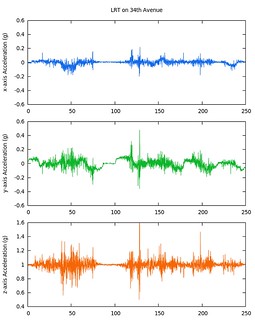
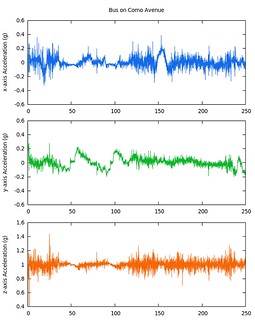
Here are two graphs I made of accelerometer data logged by my smartphone during two different trips I took on Metro Transit lines back in June: One on light rail, and the other on a regular bus. They were just experiments and shouldn't be relied on too much, but they do show that the two types of vehicles are substantially different in the ways they behave.
I've been surprised to have some difficulty finding information about ride quality on mass transit systems, particularly since I find the relative smoothness of the ride to be a compelling argument in favor of rail transit—In my view, ride quality is likely a major contributor to "rail bias." I have to put that in quotes because the implication is that favoritism toward trains, streetcars, and everything in between is based on pure emotion rather than physically-quantifiable factors.
The smartphone revolution (including gadgets like tablets and MP3 players) means that anyone can start gathering data about how good or bad their trip is and start doing some analysis. No longer do you have to wait for a report from some engineering firm contracted out to do the work, or try to sift through dense academic papers. The tool I used to gather data just ended up spitting out raw numbers, so it took a little post-processing to make it a manageable set of data, but it wouldn't be difficult for a smartphone app to be built or extended to directly present users with useful information and comparison points.
Data gathering alone will not end the old bus vs. streetcar vs. whatever else debate, but it's important to bring some real-world measurements into the conversation, since they have been lacking.
For those that are interested, my first graph shows a trip made on the Blue Line (Hiawatha) between Bloomington Central station and Terminal 2–Humphrey station in Bloomington and the MSP Airport area. The second set of data is from a route 3A bus along Como Avenue between about Hamline Avenue and Raymond Avenue. I didn't do anything special to secure my phone in place other than gently holding it down—something that would need to be changed if people try to make repeatable measurements. One document I came across suggested mounting a measuring device on top of a heavy rubber cone placed on the seat—such a cone would dampen some vibrations, but make others more measurable.
Still, with my rudimentary methods, I found it amazing in my graphs to see how much the motion on the 'x' axis (blue, side-to-side motion) went up between taking the train and taking the bus. The the green 'y'-axis plot is for front-to-back motion, while the orange 'z'-axis plot represents up-and-down motion—both of those are harder to interpret visually, though some rudimentary math suggests that y- and z-axis motion is still substantially better than the bus ride. I'll also note that the bus I took the sample on had a very thick cushion on the seat, while the Bombardier LRV I took the light-rail sample on has a very thin seat cushion.
Here are some averages and standard deviations for samples taken along the different axes. I used absolute values when making the averages, otherwise the periodic swinging past the origin line would make the x- and y- numbers very close to zero, and the z-axis average would be very close to 1 (since the z-axis is always being pulled on by Earth's gravity).
| LRT | ABS(x) | ABS(y) | ABS(z-1) |
|---|---|---|---|
| Average | 0.020 | 0.045 | 0.036 |
| Std. Dev. | 0.024 | 0.039 | 0.047 |
| Bus | ABS(x) | ABS(y) | ABS(z-1) |
| Average | 0.052 | 0.056 | 0.042 |
| Std. Dev. | 0.048 | 0.047 | 0.047 |
In these two fairly unscientific samples, the bus had average g-loading on the x-axis that was 160% higher than the bus, and it was 24% worse on front-to-back motion, and 17% worse on the z-axis. For me at 220 lbs., the aggregate motion could mean that I'd feel 20 to 40 pounds heavier on the bus than on the train, like I'm swinging around a heavy sack of salt pellets.
But the story isn't all rosy for light rail either—there's a big spike about halfway through my recording, probably due to the train crossing running through a switch, or it may just have been a jerk of my arm as I was holding the phone (perhaps both). Sometime soon I'll have to try this on the Northstar train to see how that one behaves, since it has much more substantial padding on the seats—often making the ride feel smoother—but it also has to share track with heavy freight trains which do a lot of damage to the rails. Hopefully someday we will have some local streetcars to also add into the mix of comparisons.
Friday, August 2, 2013
A rail identity crisis in Minneapolis
View Planned LRT stops in Minneapolis in a larger map
This is what the region's planned light-rail system looks like if you cut it off at the city limits of Minneapolis. It includes the Hiawatha, Central, Southwest, and Bottineau lines. While the first two largely stick to arterial corridors, Southwest (the planned Central/Green Line extension) and Bottineau (the Hiawatha/Blue Line extension) go as quickly as possible to under-populated freight railroad trenches. Again, this is in Minneapolis, where the vast majority of the region's current transit trips begin and end. Something is wrong with this picture.
As of 2013, there are 11 active stations: Ten of them opened in June 2004 when the Hiawatha Line (now Blue Line) started operation, and the eleventh—at Target Field–opened in November 2009 to coincide with the start of the Northstar commuter service. What's really surprising is that, despite the addition of three more routes, the number of stations within the city is only expected to double from 11 to 22: Four have been constructed in Minneapolis for the Green Line (Central Corridor), with probably another five expected to be added for the Southwest extension to Eden Prairie. The Bottineau extension of the Blue Line is only planned to add two stations within the city limits, almost completely bypassing the north side. Looking at these future routes, it almost seems like the Hiawatha Line would have been designed to run out of the city even faster, if not for that pesky Mississippi River in the way.
There are a couple of stops that will be just across the border, of course: Many people would be surprised to discover that the existing VA Medical Center station is just barely outside the city, in the unincorporated territory of Fort Snelling (along with the Fort Snelling stop and the two MSP Airport stops). On the Green Line, the Westgate station is barely past the border—one of the two platforms even extends into Minneapolis by just a few feet. On the planned Bottineau extension, stops at Plymouth Avenue and Golden Valley Boulevard are also just barely outside the city.
It's really remarkable how Minneapolis only gets token access in the Southwest and Bottineau projects. With locally-preferred alignments primarily along freight rail corridors. They are no longer urban transit projects, but are instead commuter or regional services in disguise. And once that fact is acknowledged, it's worth looking at how commuter and regional rail lines are set up elsewhere. In particular, why do we have to with building a double-track light-rail line right next to a freight line when they both have the same 4-foot, 8½-inch gauge? It would arguably be better for the existing freight lines to be upgraded to double-track and run passenger service over that instead of building something totally separate.
There has been some precedent for running light rail on freight tracks: The NCTD Sprinter in San Diego and New Jersey Transit's River Line between Camden and Trenton are two examples. Austin's Capital MetroRail uses essentially the same vehicles as NJT's service, though it is classified as "commuter rail". Those are mostly low-frequency services using significant stretches of single-tracked, non-electrified routes—because it was cheaper to build that way, of course. A closer analog to what's planned for the Twin Cities is likely the UTA TRAX Blue Line in Salt Lake City, which is double-tracked and uses overhead catenary for power.
Frustratingly, the Federal Railroad Administration and Federal Transit Administration have required those lines to use "temporal separation" so that passenger service has exclusive access to tracks during the day, while freight services have exclusive access to track in the overnight hours. The diesel-powered vehicles on the Sprinter, River Line, and MetroRail services are used in Europe on mixed-traffic routes, but somehow we haven't figured out how to do that in the United States because of overblown fears that freight and passenger trains would crash into each other. Even though some services like the River Line have implemented active signaling systems to automatically stop trains before a crash could even happen, the federal government has balked at the idea of having freight service share track with lightweight passenger rail vehicles during daylight hours.
At the other end of the scale, there are some very busy bus corridors in Minneapolis which deserve to be upgraded. Over time, they've been cut out of being potential light-rail lines, though the city is currently pursuing adding streetcar services—something that has caused tension between the city and the Metropolitan Council. Riding the Blue Line down Hiawatha Avenue, it's easy to see why it was derided as a "train to nowhere" ahead of its opening. There are few obvious destinations along the bulk of the route, at least in comparison to historic streetcar corridors like Hennepin Avenue, Nicollet Avenue, Chicago Avenue, University Avenue, and others. The Blue Line does have a massive traffic generator at its southern end with the Mall of America (think of the daily attendance at the Minnesota State Fair, and multiply that by every day of the year), but it's still hard to imagine that rail service along any of those streets would carry any fewer people per mile as the Hiawatha corridor. So are streetcars really the right way to improve service along a busy commercial street which likely has higher inherent transit demand?
The Hiawatha Line blew past ridership expectations when it opened, and now ranks as the 5th-busiest light rail system in the country in terms of boardings per mile. Rather than going "lighter" than "light rail" with streetcars, it seems clear that the true urban corridors in Minneapolis should be getting re-examined for fully grade-separated service like a subway (the "heavy rail" that light rail is "light" in comparison to). That concept was largely discarded in the region many years ago, the argument usually being that "Minneapolis isn't dense enough". Yet the idea hasn't really been revisited even with Hiawatha surpassing ridership levels that weren't expected for another 15 years at least.
Back in the streetcar era, the frequency of service on Nicollet Avenue was every five minutes off-peak and three minutes or less during the busiest parts of the day—it should have been possible to look down the street and see two or three coming your way and a couple of others heading in the opposite direction. Of course, the good thing about sub-3-minute frequencies is that they're showing up all the time, which makes riders happy. But cramming that many rail vehicles onto a surface line mingling with regular traffic means that any disruption can propagate down the line pretty quickly. Each streetcar also needs its own operator, while a longer train can get by with fewer employees per number of passengers.
I'm not sure transit demand is quite high enough that streetcars would go back to historic levels if they were implemented on Nicollet Avenue again, it would probably get pretty close. The Blue Line is running 3-car trains all day long (though they're probably only needed at peak times), so streetcars along Nicollet would have to run three or more times as frequently as Hiawatha's current 10-minute schedule at certain times of day. The frequency can be reduced if multiple streetcars are chained together, but that means larger boarding platforms are needed.
Proper subway lines have higher capacity, faster and more frequent service, and a minimal visual impact on the land above. Longer trains can be used since they don't have to fit between street-level intersections, and the vehicle types can be switched up if the entire route is grade-separated (traditional subway lines allow passengers to walk between cars because the operator cab can be reduced in size—there isn't a need for all-around visibility and there's no risk of crashing into automobiles). Underground trains can operate very frequently and at higher speeds since there isn't cross traffic to worry about—even curves can be eased to allow faster trains, since they don't have to fit past buildings. With rights-of-way reduced or even eliminated, more land is available for developers on the surface, meaning that costs can be offset by very intense transit-oriented development.
Washington, D.C.'s Metro system has really been a poster child for that aspect of building underground. They've also discovered that underground lines stand up better over time since they aren't exposed to weather—a major thing to consider in Minnesota with our heavy use of road salt in the winter. Going underground may also allow the deadlock to be broken between the idea of "railstitution" of busy bus routes with streetcars and the alternate concept of "Arterial BRT" (not technically bus rapid transit since it lacks exclusive lanes, but pulling in every other aspect including better stop spacing, level boarding, and off-board payment).
While the momentum behind existing transit projects in the Twin Cities shouldn't be totally disrupted, it is clear that something has gone wrong with our list of priorities when bridges and tunnels abound on the suburban Southwest LRT corridor, while the far more crowded urban segment along Washington and University Avenues saw tunnels discarded over cost concerns. This isn't just a problem for the Twin Cities region either—many other light-rail corridors across the country have taken the path of least resistance, and ridership has typically suffered because of it. That's not acceptable in a future where people will be asked to live more multi-modal lifestyles.
Friday, June 21, 2013
Bloomington to Apple Valley Red Line bus service opens tomorrow
Another iteration of my regular column on streets.mn
Apple Valley Transit Station seen during Red Line construction in October 2012.
The Twin Cities is welcoming a new transit service on Saturday: The METRO Red Line bus service along Cedar Avenue from the Mall of America in Bloomington to the eponymous Apple Valley Transit Station. The 10-mile route will have five stops: Aside from the endpoints, it also hits Cedar Grove Transit Station at Nicols Road and Cedar Grove Parkway in Eagan, and two additional stations along Cedar Avenue in Apple Valley near 140th Street and 147th Street, respectively. The route will have 15-minute headways between buses from 5 am to 7 pm on weekdays—It almost qualifies as a member of the region's Hi-Frequency Network, but falls short on Saturdays where frequency is only every half hour (Hi-Frequency routes are supposed to have 15-minute Saturday service from 9 am to 6 pm).
Have you gotten that sinking feeling yet?
The Red Line, formerly known as the Cedar Avenue Bus Rapid Transitway, has been championed as a pilot of BRT service in the Twin Cities. BRT, of course, is often brought out as an alternative for potential rail projects—usually light rail or subway/elevated "heavy rail", but sometimes an option against commuter rail or streetcar service. It was a technology born out of necessity in poor Latin American countries. City planners sought out ways to optimize their disorganized bus systems (which often were—and still are—run by a number of independent companies) rather than building expensive railways. It is a technology which has since spread around the world.
BRT was invented when dedicated busways were combined with specially-designed stations which matched the buses' floor height, allowing level boarding. The stations also allowed passengers to use the normally wasted time in between buses to purchase tickets ahead of time. The buses themselves were usually articulated (sometimes double-articulated), with a larger number of wider doorways—in some cases on the "wrong" side or on both sides of buses so that boarding platforms could be constructed in the center median of a busway.
Unfortunately, as the idea of bus rapid transit spread, it was often watered down—especially as implemented in the United States. Proper dedicated lanes terminate before reaching congested areas. Routes get implemented with unnecessary loops or one-way sections. Pre-paid boarding gets cut, requiring passengers to waste time fumbling for cards, bills, and change as they step onto the buses. The Red Line has not been immune from those trends.
First, it is difficult to say whether the Red Line has a dedicated busway or not—strictly speaking, I would have to say no. Buses will travel in the right-hand shoulder lanes, an extension of the of bus-only shoulder program that has been implemented on 300 miles of roads across the Twin Cities. Buses will have to deal with right-turning vehicles sharing the surface segment of Cedar Avenue through the heart of Apple Valley. The route has implemented transit signal priority at intersections, which should help keep traffic flowing, but there will still be turbulence in places where cars and buses share space. The freeway segment of the route has a speed limit of 65 mph, and buses also have to mingle with regular traffic at on- and off-ramps.
Cedar Avenue is very wide now, able to maintain a 2+1+2 configuration even with half the road surface under construction.
Second on my list of Red Line issues is station placement: The Cedar Grove station is only accessible via surface streets, adding 3 minutes or more to northbound trips and at least 5 minutes to southbound trips. New ways of accessing the station are undergoing a year-long study process, but it's not clear when this major defect will be fixed. To the south, the 140th and 147th Street stations are being opened without any skyway connections across the wide highway, unlike AVTS as seen in the first photo, and they are not well located right at intersections with crosswalks. Other potentially valuable stations are completely missing, such as one which had been proposed at the Palomino Hills park-and-ride, one of the more densely-populated residential nodes along the highway which could benefit from better access to commercial zones along the route.
Another component that's currently missing is off-board pre-payment. The Apple Valley Transit Station has ticket vending machines (TVMs) installed for the start of service, but they are not yet installed at the intermediate stops along the route, and the Mall of America stop seems to be relying on existing machines used for the Blue Line (Hiawatha LRT). Ideally the Red Line will soon behave just like the Blue Line, where everyone onboard must carry a transfer or validated pass as proof of payment. However, it appears the line will require to pay or validate their fares upon boarding until machines are deployed to all stops.
The Red Line is an interesting experiment in the effort to make bus service better. While significant pieces are missing, fixes are at least in the pipeline. We'll see how long they take to arrive. The biggest challenge of all will involve finding new ways to overcome the suburban geography of the route, where pod-like developments are spread through the square-mile sections laid out by surveyors in the 19th century. Will this type of busway offer a way to balance out the natural tendency of car traffic to pile up along section-line roads?
It is worth noting that express bus service in the corridor has been expanding for several years already, to destinations including downtown Minneapolis, downtown Saint Paul, the University of Minnesota, and the Mall of America. The Red Line offers the first true station-to-station service along the highway, consistently making the same stops throughout the day.
Here's a breakdown of the corridor's $112 million budget:
- $57 million for 4 miles of highway and bus shoulder improvements.
- $34 million for express service expansion, including vehicles and facilities.
- $21 million for Red Line service, including vehicles and facilities.
Friday, June 7, 2013
Rochester's Zip Rail holds first EIS meetings

The Zip Rail project to connect the Twin Cities to Rochester with a fast train service has finally entered into a Tier I Environmental Impact Statement process, more than two decades after the concept of connecting Rochester was first dangled in front of the public. The EIS team held their first open houses this past week, showing off a number of routing alternatives and explaining some of the challenges that have to be resolved. Many different concepts for routings and endpoints have floated over the years, and the project has to weed out which options are the most feasible and likely to succeed.
If my math is right, it has now been 22 years since my dad took me to a public meeting in Rochester about a Twin Cities to Chicago high-speed rail line. That was back when Minnesota, Wisconsin, and Illinois had collaborated on the Tri-State Study which envisioned linking the two metropolitan areas at speeds up to 185 miles per hour with TGV-like trains on steel rails, or even 300 mph with maglev trains—a technology that hadn't seen any real-world deployments at the time and remains extremely rare today. While historical Twin Cities to Chicago trains were mostly known for running down the Mississippi River 45 miles to the east of Rochester, that study had found that rerouting the trains to go through Rochester would give access to a significantly larger population and could have time and cost advantages because of flat, open land that could allow far gentler (=faster) curves than what was generally possible along the river valley.
However, in the 1990s, the consensus among state and federal planners across the country shifted from the goal of building "true" high-speed rail that pushed the boundaries of what could be accomplished with train technology. With the government unwilling to hand out money billions at a time like what was required, the idea became that it was better to take a more incremental approach. Existing freight corridors would be reused, and trains would be pulled by diesel locomotives that would remove the need for the overhead catenary wires. There would also be less effort put into adding grade separations—bridges, cuts, viaducts, and tunnels—in order to save money. In the end, plans for super-speed trains across the country pushing 200 mph were generally watered down to plans for service at 110 mph.
This had an impact on the idea of going through Rochester, which had always added a significant distance to the route. The time savings of having more consistent high speeds were largely washed out because of the extra length. After many years of wrangling, MnDOT finally decided in November 2011 that the first enhanced-speed train service to Chicago would run along the existing Empire Builder route (used by the Milwaukee Road Hiawatha prior to the formation of Amtrak).
Another potential problem with building a super-speed line in the United States is simply the fact that our passenger rail network is really minimal and has largely stayed that way since Amtrak appeared in 1971. That wasn't always the case, of course—rail lines weaved all across the country, really only thinning out in the least-populated states of the West. As this series of maps shows, the passenger rail network had rapidly become less than skeletal in the decade up to the formation of Amtrak. Other countries that have built true high-speed lines have been able to overlay them on top of pretty dense networks of existing passenger service, but that is practically nonexistent here.
It has slowly dawned on federal, state, and local governments that it's also necessary to rebuild regional networks of conventional-speed trains. Today, statewide rail plans need to be in place in order to receive significant federal funding. Minnesota released a 20-year plan back in 2010, which included a link to Rochester regardless of whether it ended up being on the primary route to Chicago or ended up as a branch by itself. At this point, environmental review processes are now underway on three routes: Rochester, Duluth (Northern Lights Express, now advanced into Preliminary Engineering), and the river route to Chicago. The latter route's future remains a bit murky due to Wisconsin's political antipathy toward enhanced-speed service, though they are still participating in a parallel process that should result in a second daily round-trip between Saint Paul and Chicago.
Ahead of the EIS, the Zip Rail team has been working on a Service Development Plan to work out travel demand and how the line may meet those needs. No details have been released yet, but comments by presenters, including in this KARE11 report, indicate that it will do better than break-even with its farebox recovery ratio. If that pans out, it would open up a funding source from the Federal Railroad Administration that would cover 80% of the capital cost with federal dollars, only leaving Minnesota and the local governments on the hook for 20%—just like the Northern Lights Express route to Duluth.
A multitude of specific route alternatives have been proposed for the service, and it's not even clear yet where the route will begin and end. On the northern end, there is desire to reach downtown Minneapolis (The Interchange), downtown Saint Paul (Union Depot), MSP International Airport, and some southeastern suburb. It's not practical to reach all four of those, and even hitting more than two would prove challenging.
Some have advocated running directly between MSP airport and Rochester International (RST), but that would miss the center of action at both ends. Reaching MSP would require building new rail alignments within the urbanized area of Saint Paul or the Twin Cities' southeastern suburbs, plus a crossing of the Minnesota River, Mississippi River, or both. Meanwhile, RST airport is a good eight miles from the main Mayo Clinic campus in downtown Rochester—it's closer to the neighboring town of Stewartville.
On the main trunk of the line, there are two options that have been considered: either closely paralleling U.S. Highway 52 or running further west and making use of an abandoned rail corridor (built by the Chicago Great Western) when convenient or building anew to bypass sharp curves and small towns. It appears unlikely that any stops would be included between Rochester and a (potential) suburban Twin Cities stop. Along the U.S. 52 alignment option, the largest intermediate town is Cannon Falls. The CGW alignment gets frustratingly close to Northfield, running through the hamlets of Stanton and Randolph, each about halfway between that college town and Cannon Falls.
And lets not forget about speed, frequency of service, and related issues. MnDOT's 2010 state rail plan suggested building along an alignment with curves capable of 150 mph, but beginning service with diesel-powered trains maxing out at about 110 mph (going significantly faster typically requires electrification as well as a fully grade-separated corridor). The Zip Rail team claims to be looking at speeds up to 220 mph, but again it might just turn out that they'll build on an alignment capable of super-speedy service someday, but will initially implement the slower, un-electrified service. Also, with the short distance, it could easily become a waste to go super-fast, since the amount of time actually spent running at top speed wouldn't be all that long. Would it kill you if the train took 50 minutes instead of 40, especially when the highway travel time is 90 minutes by comparison?
It's not entirely clear how often trains would run either. Some studies have proposed up to 20 round-trips daily, and why not? If the bulk of the corridor is dedicated to passenger service, it makes sense to run as many trips as are practical. And if the end-to-end time for a train is less than an hour, it wouldn't take much staff or equipment to run the service all day long. A good deal of thought would need to go into picking the right size of train, though: Too small, and the economies of scale just wouldn't work out. Too big, and the capacity would swamp demand. (In the extreme, there's no need for a double-height, double-length TGV Ouigo with 1,268 seats, for instance.)
Still, the number of trains would probably be constrained by the amount of pre-existing freight track used within the Twin Cities. At the meeting I went to on Tuesday, 8–10 round-trips were suggested, again on par with NLX and still far better than train service in most of the U.S.
Since this will be a largely "greenfield" alignment no matter what, the cost will be steep. Whatever the cost is, it should be contrasted with the amount of economic activity going on in Rochester, estimated to be in the billions over the next several years merely based on the Mayo Clinic's activities. A series of past studies have estimated a significant positive impact from such a train, so it's hard to expect a different outcome this time. The route also has the potential benefit of becoming the first leg in a truly high-speed link between the Twin Cities and Chicago, the two biggest economic centers of the Midwest. The road ahead is long, though—The EIS is expected to take 24 months, and it may still be another decade or more before the Zip Rail project lives up to its name.
Friday, May 24, 2013
Where's my bus (arrival sign)?

A NexTrip arrival sign at the Uptown Transit Center in Minneapolis.
Real-time arrival information for buses in the Twin Cities area has been publicly available since 2008, when Metro Transit added NexTrip functionality to their website. It was updated a year later to include a mobile web version. Eventually the communication protocol used under the covers for both the mobile and desktop websites was simplified and made publicly available, and there are a number of computer programs and smartphone apps available to get at that information. For me, NexTrip ranks as a "killer app"—a program so useful that it could justify the purchase and continuing use of a cellular data plan and smartphone (or an Internet-enabled "feature phone") all by itself.
While anyone can access arrival times through a mobile device, the deployment of permanent digital signage at bus and light-rail stops has been maddeningly slow. While the Blue Line on Hiawatha Avenue has had LED panels in place since it opened in 2004, they have only been used for showing the current time and periodic admonitions to stay behind the yellow line, report suspicious activity, keep your belongings close, and so on and so forth. There have only been intermittent sightings of any schedule information going up on the boards.
A handful of busy bus stops have the signs. Transit centers at the Mall of America and in Uptown have them. There's a sign tucked away at the busiest single stop in the system at 7th and Nicollet. Along Interstate 35W, the 46th Street BRT stop also has some real-time displays.
The most ambitious deployment of NexTrip signage in the Twin Cities was in the "Marq2" project, an impressive system of doubled-up bus lanes in downtown Minneapolis on Marquette and 2nd Avenues that serves suburban express buses. Every stop along that project has a large LED panel to show arrivals—a pretty useful tool considering how many different routes are funneled down those lanes. Still, it seems there are only dozens to perhaps a hundred installations of real-time arrival boards across the region's network of 14,000 bus stops—probably less than 1% of the total, and not corresponding all that well to the busiest stops or routes.
It's hard to understand why this is still the case in an era when unlocked, unsubsidized smartphones can cost as little as $125. As a proof of concept, it would be easy to slap one of those into a weathertight box and attach a solar panel to recharge it. Within Minneapolis, such devices could make use of the city's municipal Wi-Fi network to receive data, minimizing or eliminating the need to pay for cellular network access. Some further engineering might probably be needed to handle the extreme depths of cold in the winter and heat in the summer that we get around here, but it's not insurmountable. Since a tiny smartphone screen would be hard to read at a distance or in direct sunlight, a real deployment would have to rely on larger LED panels (where costs for bulk quantities are measured in dollars per square meter). An interesting alternative might be an electronic paper display like that in the Amazon Kindle, potentially allowing printed paper schedules to be eliminated entirely.
Done right, it's likely that hundreds of displays could be built for the cost of a new bus, let alone a whole transit line, although operational costs would eat into that a bit. While informational displays don't seem to get much backing since they don't directly impact travel times, they do provide a huge psychological benefit to users of a transit system. Eliminating or reducing the worry that you've just missed the bus has a tremendous value and is certainly worth the investment now that the technology behind it has become so cheap and data accessibility is not the problem it once was.
Friday, March 29, 2013
Duluth train finishes major stage of environmental review

The proposed Northern Lights Express train from Minneapolis to Duluth ("NLX") took another step forward on Monday last week when the long-awaited Tier 1 Service Level Environmental Assessment was finally released. Initially expected to be completed by October 2011, the environmental review was delayed as the scale of the project was reassessed after early cost projections came in higher than expected. Since 2007, the route has been planned to operate at a top speed of 110 miles per hour, though the proposed length of that fast section of the route was reduced in 2011, lengthening the typical end-to-end travel time from two hours flat to 2 hours and 17 minutes. Today, the $820 million service is planned to have eight daily round-trips with six total stops: Minneapolis, Coon Rapids, Cambridge, Hinckley, and Duluth in Minnesota, plus Duluth's twin port of Superior, Wisconsin.
One of the first comments I got after posting a link to the EA last week was a question: "Why do we need an environmental assessment to run a daily passenger train to Duluth over existing tracks?"
That's a good one to ask, and I don't have a very good answer. The route has existed for well over a century, and passenger trains ran on the line until 1985, so it's worth asking why something that is partially a restoration of former service should require an extensive environmental process. However, the proposal does push beyond the historical level of service considerably. A full history may reveal more, but this 1951 timetable shows just two daily round-trips along the route, plus another three on parallel railroads (both of which have seen major chunks of the route abandoned). In order to achieve eight round-trips a day and to allow faster speeds, a new parallel track is planned for 41 miles between Isanti and Hinckley. Most of the rest of the route would be limited to speeds of 79 or 90 mph, while this new segment of double-tracking (where there has historically only been a single track), will be the section dedicated to 110-mph operation.
Some other shorter segments of additional track will be installed in Minneapolis, between Fridley and Coon Rapids, and on the northern end in Superior. However, all of these are expected to fit within the original right-of-way granted to the railroad in the 19th century. There is certainly some call for the Environmental Assessment, though it shouldn't be treated any more significantly than a typical highway widening. Ultimately I'll answer the question with a question: Was the Northern Lights Express put through any more hoops than a project to add lanes to a freeway? If this review was more complicated than that, then some priorities need to get straightened out.
Another comment I received related to the pace of construction for the route. Wouldn't it be better to start out with one or two trains a day and then scale it up incrementally?
That has certainly been considered, but there are many examples from around the country which show that incremental builds take ages to complete. Among the dozens of routes Amtrak operates nationally, only a handful of corridors have 8 or more daily round-trips today, a level of service that would be considered modest in Europe.
In the Northeast, only the Northeast Corridor from Boston to Washington, DC and branches off of it from New York to Albany, Philadelphia to Harrisburg, and DC to Richmond have 8+ daily round-trips. In the whole rest of the country, only two other corridors in California do as well: Los Angeles to San Diego, and Sacramento to Oakland.
View map
A few other routes have five to seven trains each direction each day. Why should a route to a relatively minor metropolitan area of 280,000 people be at the same level as these major corridors? Another very good question. There really should be many corridors across the country that see that much passenger train traffic or more. This route is also planned to have an average end-to-end speed of 67 miles per hour, and there's only one route anywhere in the U.S. running faster than that today: The Acela Express from Washington, DC to Boston. Everything else falls in the range of 38 to 57 mph.
The NLX planners used computer models of ridership to come up with the speed and frequency of service. The models told them that this speed and number of trips are the bare minimum needed in order to operate the trains without a direct subsidy year over year. 67 mph is just barely faster than a typical driver will do over a whole trip (keep in mind that Interstate 35 has a 70 mph speed limit for most of its length between Duluth and the Twin Cities—most drivers will have top speeds reaching or exceed that, but any stops or slowdowns along the way will cause average speed to drop rapidly).
When costs are spread out across the number of passengers who will use the service over time, it also works out pretty well. A typical Amtrak short-distance "corridor" route requires an operating subsidy of $20 for every 100 passenger-miles traveled, the projected average trip length for NLX passengers. Existing corridor trains have periodic needs for additional capital costs as well. The Northern Lights Express is expected to start out carrying over 900,000 passengers in early years, and slowly but steadily growing from there. Over the next 30 years, that probably translates to 33 to 40 million passengers. If the project can achieve what the computer models say and operate without significant subsidies, the capital cost per rider would work out to somewhere between $20 and $25 for that time span.
So you can start out with a slow, infrequent train and pay half the cost of each rider's trip in order to entice them to use the service, or an up-front investment can be made to improve travel times and add frequency, and the overall cost works out to be about the same—potentially better in some cases. If we went with an incremental approach, there would be years and years worth of direct operating subsidies, plus the capital investment would probably work out to just as much as what's currently planned.
While the initial price tag is certainly giving some of our state politicians heartburn, in the long run, it works out better to invest in the route now.
Friday, March 15, 2013
Inducing demand for sustainability
The idea of induced demand is a strange one. You would think that building a highway or widening a road would alleviate congestion by spreading out the existing traffic across more space, and that would be the end of it. Toss in a little extra width in anticipation of population growth, and it should be possible to leave it alone for several decades, right?
In reality, new and expanded highways tend to see traffic counts rocket upward and approach full capacity in just a few short years. Highways can pull traffic from nearby low-speed streets and also practically create demand out of thin air. When new trip opportunities open up, people take them. New destinations become reachable, which drives more traffic, which drives more businesses and people to locate out along the highway, continuing the dizzying spiral. This cycle has motivated a lot of economic activity across the country, but it has caused a great deal of damage to our environment in terms of pollution as well as dramatically altered landscapes. In many ways, our culture has shifted from being freed by car ownership to being shackled by it. Most American cities only have tiny areas in them where it's possible to go about doing everyday tasks on foot, by bike, or on public transit without spending inordinate amounts of time doing so.
The country has spent about 90 years first building out a basic highway network, and then overlaying freeways on top of that a few decades later. Today, car-based travel retains a huge advantage over every other way of getting around the vast majority of the time. Despite that, there are small pockets showing that it is possible to dethrone the car as the king of the mountain, though it's harrowing to ponder whether alternatives can scale up fast enough to help us prevent the planet from melting.
Cities across the country have watched bicycle ridership boom as new bikeways are added, whether they are traffic-calmed neighborhood streets, new bike lanes on busier thoroughfares, or dedicated infrastructure. Use of public transportation has also been growing rapidly in recent years, with 2012 reported as the second-busiest year for urban mass transit since 1957. Amtrak has been setting ridership records constantly, more than doubling ridership since the railroad's introduction in 1971. Of course, the country has grown in population by 100 million since 1971, and far more since '57, so there's still a long way for them to climb.
Some transit systems around the world have been dealing with continuing growth straining their systems for decades. The London Underground comes to mind as one—in recent years, the system has been so crowded in central areas that kiosks with maps and other wayfinding information have been installed above-ground to encourage people to walk rather than ride the rails to their destination.
Meanwhile, the TGV network in France has shown that it's possible to operate trains profitably at high speed while offering very low fares. While most other high-speed services have marketed fast trains as a premium service, France has pivoted in the opposite direction by making them cheap to encourage their use over slow, meandering classic routes that had been congested with passengers hopping between small cities and towns. Recently, the "OuiGo" service was introduced with fares starting as low as €10 and maxing out at around 85 for a 500-mile journey. With a range of $0.02 to $0.17 per mile, it's extremely cheap—the low-end fare is as low or lower than what it would cost to simply provide power (fuel) to an electric car over such a trip, not counting wear-and-tear or other operating costs.
Of course, one of the TGV network's tricks has been to progressively increase the capacity of their trains over time. Individual bilevel TGV Duplex trains carry more than 500 passengers each, and two trains are often coupled together to have a capacity over 1,000. The trains used in OuiGo service bump that up to around 1200 by converting café cars into more seating space. So if you have 1,200 passengers, it's possible to get by with razor-thin profit margins per seat.
At such prices, the French rail operator SNCF is most certainly inducing travel demand that would otherwise not exist. One could ask, have they gone too far? That's a question for the age, isn't it? Of course, high-speed trains run on electricity and French ones primarily get power from nuclear plants, so these new riders probably aren't making much of a dent with CO2 emissions, but there could be other effects such as the depopulation of small towns away from the high-speed network in favor of others that lie directly on it.
Back here in the U.S., Amtrak tends to charge high fares on busier corridors with higher service frequency, while charging less for quieter ones. And the only high-speed train in the country, the Acela Express, seems to get a price category all of its own. Long-distance trains are mostly priced in the $0.15 to $0.20/mi range, with shorter-distance "corridor" trains ranging from $0.20 to $0.45/mi. The Acela tips the scales with an average fare of $0.78/mi, probably at least eight times the average OuiGo fare. But even here, we can see the effect of lower fares on ridership.
In the above graph, I plotted passenger-miles versus train-miles, with color indicating frequency of service, and the size of the circle showing the average fare per passenger-mile. It always amazes me that the Empire Builder does so well in terms of ridership when it runs through the sparsely-populated states of North Dakota, Montana, and Idaho on its way to the Pacific Northwest. It was ranked 3rd in terms of passenger-miles according to the FY2011 data I used, trailing only the Northeast Regional and Acela Express on that measure (for clarity of other routes, they have been cropped out of the graph).
Now why would the Empire Builder do as well as it does? Part of it is just that the train goes a long distance and has many places to pick up and drop off passengers along the way, but there are other long-distance routes in the system that go just about as far and hit far more well-populated areas. That remains something of a mystery to me, though there are a few other points in its favor. The Empire Builder is also really two or three trains in one, branching into two parts to reach both Portland and Seattle, plus often gaining an extra car on the leg between Saint Paul and Chicago. Looking at this plot of data, it also seems that cheap fares could attract many people who would otherwise stay away.
Perversely, one of the major outliers in this graph is the Auto Train, an oddball non-stop service between the D.C. suburbs and Florida which lets passengers bring their car along. Even when Americans ride trains, we are enticed by new ways to move our cars around.
Anyway, could Amtrak benefit from flipping their current pricing model on its head and driving down costs on its popular services rather than ramping them up further and further? It sure seems like many higher-cost routes have suppressed passenger demand. It might work in some cases, but Amtrak has always been hamstrung by an inflexible route network and fleet of rolling stock. There simply isn't the equipment to duplicate the French model of dumping 1,000 or more passengers into a single train and sending it down the track. The Acela has been stuck with a fixed seating arrangement carrying barely more than 300 passengers at a time. Amtrak also hasn't been able to benefit from a fresh new network of high-quality lines built with good levels of cost control. Rather, the railroad has been saddled for decades with aging equipment and routes in need of maintenance. Efforts to remake the railroad have always come in fits and starts, without the sustained cohesive planning and funding necessary to really make it work the way it should.
Of course, one thing that is true about the French rail network is that the track owner (RFF) raises prices for whole trains as routes get busier, but SNCF (the company operating the rolling stock) has done what they can to use economy of scale to drive down costs for individual passengers. It'll be interesting to see if they can continue the process in the years to come, or if the commoditification of travel will finally hit a wall at some point.
Zooming back out (or perhaps back in) to look at other ways of getting around, urban mass transit may have similar forces at play compared to what drives railroad ridership. Even though our regional bus network has rush-hour fares of $2.25 for local buses and $3.00 for express, many people balk at paying that price to get to work or other destinations around town. It's not all that much—you can make it to work and back for less than the price of a medium dark chocolate mocha at the local coffee shop. But still, when overall transit ridership remains relatively low, why don't agencies simply look at reducing fares or even eliminating them in order to attract more people?
Well, we do have a couple local examples of that happening. The Northstar commuter line had fares reduced last year, and reports are that it has had a strongly positive impact on the number of passengers carried. Of course, the fare reduction was also accompanied by a targeted advertising blitz and the opening of an additional station in Ramsey, so there was probably a combination of things going on there. At the University of Minnesota, the campus has been running a free-fare bus service for students for at least 15 years now. It's the second-busiest transit system in the state, so they must have done something right. But service frequencies dropping as low as a minute or so apart, some would argue that it's too nice of a service to have. Students are highly opportunistic in their use of the campus shuttles, and will sometimes take them even if it doesn't really save any time when compared with walking.
For motorized transportation of various kinds, we know that use can scale up almost 1:1 with capacity, particularly if the cost to use the system is free or nearly free. At a certain point, it becomes necessary to start diverting or suppressing traffic by adding costs, or adding barriers of sorts, such as intentionally slowing things down or reducing service. But as congestion gets monetized, it's also important to make sure that the cash flow doesn't become an incentive to overbuild.
And before I wrap up, it's important to note that walking and biking, which are extremely cheap and have essentially no carbon footprint, should be prioritized highest of all in our ways of getting around. Both have been extremely neglected over the last century. Now, that doesn't necessarily mean building sidewalks everywhere or continuing to rip out rail infrastructure in order to build new bike trails, but it does mean that planners should always be thinking with their feet. How will this new development face the street? Will the design reinforce our human curiosity and make it an interesting place to walk or bike past, or will it silently push people away with blank walls and dull tones? Do our streets and rail lines have safe ways for people to get across?
The current generation has to work on flipping our transportation system upside-down, not to mention retrofitting our massive inventory of buildings, in order to find the efficiencies needed in order to keep climate change at bay. Finding a true balance between need, desire, and sustainability is the challenge. It will require new ways of thinking, but it can be done.
Monday, March 4, 2013
How (not) to fill a train
I wrote a simple Python script to simulate customers attempting to book passage on a 100-seat train making journeys of anywhere between two stops and 40 stops (each number of stops was simulated 20 times). Each customer chose a random start and end point for their journey. Seats are filled on a first-come, first-served basis: The first passenger always gets seat "0". As each customer comes along, the program checks to see if seat "0" is occupied for any portion of the planned trip. If it is, then the program moves on to seat "1". The process repeats as necessary until the list of seats is exhausted. I set up the program so that 500 attempts would be made for every test—for a stop count of 2, 100 passengers were able to get seats, but 400 other customers were rejected.
That's a very simplistic algorithm which doesn't work very well. It becomes difficult to add more passengers after just 5 stops. Amtrak does better than this, though it's also worth noting that Amtrak reservations are typically on a per-car basis rather than per-seat (per-seat was more straightforward for me to model), so some of the seat conflicts are resolved naturally.
There are a lot of computer performance graphs out there which look exactly like this. In particular, I think of multi-processor systems of yore (i.e., 10–15 years ago). Today, well-written software is much better at scaling almost linearly with the number of processor cores. Some better scheduling software would probably help Amtrak on routes with many stops, but unlike computer programs, people can't be moved around in the same ways.
Here are graphs using both a normal and log scale for the number of stops:
How distance matters: A map and two charts
I've made a couple of aborted attempts at ranting at the Brookings Institution's Amtrak report published on Friday. Instead, I'll just post some graphs I made from their data which seemed interesting.
On Amtrak routes, ridership per train appears to scale with the log of distance. Ridership continues to rise as route length increases, though the rate of increase drops off as routes get longer. Shorter routes tend to have higher frequency of service and more closely-spaced stations. The longest routes also go through some of the least-populous areas of the country (western states). Of course, the sparseness of population doesn't explain why the Empire Builder is the most-ridden long-distance route. The fact that it's basically two (or even three) trains in one might, though.
First, I'll toss in my map of Amtrak station ridership across the country, since I haven't posted about it yet (I still have to work on describing it better at some point):

Now here is ridership per train (annual ridership divided by trains per year) versus distance (log scale), with the size of the circle showing riders per train-mile. Circles are colored according to frequency of service.
This graph plots riders per train-mile versus distance (log scale on both axes), with riders per train as the circle size. Also colored according to frequency of service.
There's a common statement in rail punditry that 400 miles is the limit for viable service, and it's often stated as though ridership suddenly drops off a cliff at that point. I suspect the 400-mile distance really has more to do with political and geographical boundaries. Within the U.S., individual states are often 200 to 400 miles across. In Europe, the Mediterranean Sea is about 400 miles away from Paris.
Anyway, these graphs also indirectly show that ridership scales more or less linearly with frequency of service -- add a second train, and you should expect roughly twice the ridership. So one question worth asking is whether operational costs scale linearly with frequency of service or not.
I'll note that I mostly used frequency of service from Brookings' report. Frequency and route length both become a bit fuzzy since some corridors will only have trains run for part of the distance. I've also noted in the past that Amtrak counts "corridor" trains as Northeast Regionals for the distance they run in the NEC. So the Regional's numbers are probably inflated, while corridor train numbers are deflated (such as the Vermonter). I haven't tried to compensate for that in these graphs. My only change to Brookings data was to tweak the frequencies for the thrice-weekly Sunset Limited and Cardinal and the quad-weekly Hoosier State.
On Amtrak routes, ridership per train appears to scale with the log of distance. Ridership continues to rise as route length increases, though the rate of increase drops off as routes get longer. Shorter routes tend to have higher frequency of service and more closely-spaced stations. The longest routes also go through some of the least-populous areas of the country (western states). Of course, the sparseness of population doesn't explain why the Empire Builder is the most-ridden long-distance route. The fact that it's basically two (or even three) trains in one might, though.
First, I'll toss in my map of Amtrak station ridership across the country, since I haven't posted about it yet (I still have to work on describing it better at some point):
Now here is ridership per train (annual ridership divided by trains per year) versus distance (log scale), with the size of the circle showing riders per train-mile. Circles are colored according to frequency of service.
This graph plots riders per train-mile versus distance (log scale on both axes), with riders per train as the circle size. Also colored according to frequency of service.
There's a common statement in rail punditry that 400 miles is the limit for viable service, and it's often stated as though ridership suddenly drops off a cliff at that point. I suspect the 400-mile distance really has more to do with political and geographical boundaries. Within the U.S., individual states are often 200 to 400 miles across. In Europe, the Mediterranean Sea is about 400 miles away from Paris.
Anyway, these graphs also indirectly show that ridership scales more or less linearly with frequency of service -- add a second train, and you should expect roughly twice the ridership. So one question worth asking is whether operational costs scale linearly with frequency of service or not.
I'll note that I mostly used frequency of service from Brookings' report. Frequency and route length both become a bit fuzzy since some corridors will only have trains run for part of the distance. I've also noted in the past that Amtrak counts "corridor" trains as Northeast Regionals for the distance they run in the NEC. So the Regional's numbers are probably inflated, while corridor train numbers are deflated (such as the Vermonter). I haven't tried to compensate for that in these graphs. My only change to Brookings data was to tweak the frequencies for the thrice-weekly Sunset Limited and Cardinal and the quad-weekly Hoosier State.
Friday, January 18, 2013
Seeking the transit-friendly highway
The one-way-only Huron Transit Station near the University of Minnesota. Literally a half-hearted attempt at using freeways for bus service. [View Larger Map]
As I first started exploring Metro Transit's bus network in college, I was struck by how much freeway mileage in the Twin Cities doesn't carry any transit service. Having grown up near Rochester and typically only visiting or driving through the metro area a few times per year, my mental map was mostly built up of Interstates and other major highways, so many of the landmarks I wanted to visit would require long, slow trips on urban local bus routes, and many destinations were simply out of reach with the time I had available. That might not have been the case if there were more freeway-running routes that had more symmetrical schedules throughout the day.
There is an extensive network of express routes for ferrying suburban workers and students into our twin downtowns and the University of Minnesota—and some highways (such as I-35W near Lake Street) do see buses going by a couple times per minute at peak times. But, with a few notable exceptions, express routes tend to run as if they were local routes for a short distance to pick up riders out in the suburbs, then go non-stop to a major core-area destination. There are some places where express buses stop partway along highway, but even then, it may only be a flag stop for riders getting off or the bus may skip past the stop on certain runs. The inconsistencies can induce nightmares for first-time passengers.
Good transit lines, on the other hand, make regularly-spaced stops. The spacing can vary depending on how much speed is desired, but they really gain strength from connecting a variety of different locations rather than focusing on bunch of origins clumped together at one end and a cluster of destinations at the other. The number of practical trip combinations is usually much higher and attracts more riders.
The core reason why express bus routes avoid stopping along the way comes down to the defining feature of a freeway: They're made for non-stop travel by vehicles making point-to-point trips—they're not made for buses picking people up and dropping them off along the way. Continuous flow is the goal with a freeway, and the only places where a vehicle is supposed to stop are at the ends of off-ramps.
A freeway corridor is an assault on the senses for any pedestrian, with noise, pollution, and the risk of being run over on nearby streets by drivers who haven't quite gotten their mind out of "freeway mode" yet. So while it's pretty easy to put bus stops right at diamond interchanges, they can be very unpleasant places to be.
Diamond interchanges are some of the best candidates for bus stops along freeways, since buses can pull off the highway, hit a stop, and then get right back on. However, many interchanges these days use different designs that don't allow buses to get off and right back on. In some parts of the Twin Cities, there are some bus routes which get off the highway and then loop around on local streets and special service roads to access nearby transit stations, but that drastically reduces the average speed of travel for passengers.
Along the nearly-opened Red Line in the south metro, the first station south of the Mall of America is the Cedar Grove Transit Station. It's next to the 65-mph Minnesota State Highway 77 (also known as Cedar Avenue), but accessing the station requires looping back from the junction with Diffley Road 3/4 of a mile away. Stoplights and lower speeds on surface streets mean that reaching the station adds around 6 minutes to the travel time. This is along a route that's only going to operate over a 9-mile route when it opens (expected to grow to 12 or 15 miles eventually).
So why didn't planners simply decide to put in a station right at the Diffley Road junction? I don't know the definitive answer, but it's worth pointing out that the distance between the northbound and southbound on-/off-ramps is around 900 feet, and the distance between the nearest frontage roads on either side of the highway is almost twice that (about 1760 feet). The sheer scale of suburban and rural freeway junctions creates a huge barrier—most transit bus riders are only willing to walk about 1/4-mile (1320 feet) on each end of a trip, meaning that the pedestrian "shed" for such a stop would be completely devoid of any potential customers. That's in contrast to junctions along urban corridors like I-94 in western Saint Paul and I-35W in south Minneapolis, where the distance between eastbound/westbound or northbound/southbound ramps is about 330 feet.
This isn't just a problem for metro-area transit buses, though—intercity routes also have similar problems. While Interstate highways sliced right through residential areas of major cities across the U.S., smaller towns were usually bypassed instead. Places where the main drag was once a state or U.S. highway often saw the new freeway entrance built a mile or two away. While the "highwayless town" does have certain advantages, it did mean that bus routes which once hopped along from one small town to the next (often attempting to mimic old rail lines that had also gone right through town centers) had to shift to picking people up and dropping them off out on the fringes.
Official stops for services from Jefferson Lines, Greyhound, and other bus lines are typically located as close to the highway as possible in the parking lots of gas stations, McDonald's restaurants, and so on. Windswept, empty places without much shelter (at least once the convenience store or restaurant manager tires of letting passengers hang out inside).
Other problems with connectivity also plague freeway-borne bus routes. In south Minneapolis, the 46th Street station on Interstate 35W is skipped by many buses that run east-west along MN-62, simply because it's difficult to maneuver southbound buses across 3 or 4 lanes of traffic in the 1-mile distance between the station and the MN-62 exit. The first true freeway BRT station in the Twin Cities is underutilized as a result.
When done right, freeways are engineering marvels. They dramatically increased mobility across the U.S. following World War II, but they've been lacking crucial design elements to make them proper conduits for mass transit as well as cars and trucks. These highways could have been built differently, with better options for bus stops and stations, and possibly dedicated ramps and busways for reaching city and town centers more rapidly than what would be possible by car.
Are there opportunities to flip this equation around? The Twin Cities does have the country's most extensive network of bus-only shoulders to bypass congestion on freeways (as well as some surface highways), but most of that mileage only improves travel times for suburban commuters and does little to help urban dwellers who dominate transit ridership in the region. In some cases, buses on freeways won't provide any better access than urban or suburban local routes, but it's a ready-made network of high-speed, grade-separated infrastructure that shouldn't be ignored as we face the challenges of the 21st century.
Subscribe to:
Posts (Atom)