Thursday, December 8, 2016

Potential paths for passenger rail in North Dakota

My last few posts have looked at the rail networks in Minnesota and Wisconsin to look for opportunities for adding passenger service where little or none exists today. I also examined the system in Norway, a country with a similar population to Minnesota and Wisconsin, yet with a much more functional and robust intercity public transportation system than can be found almost anywhere in the United States.

This time I'm taking a look at North Dakota, one of our neighbors to the west and a state which also lies along the route of the Empire Builder, Amtrak's only service through our two states. Despite having only about 1/7th the population of Minnesota, North Dakota still has a huge 3,480-mile rail network as of 2014. That's 78% the size of Minnesota's system (4,444 miles), 97% as big as Wisconsin's (3,600 miles), and 137% the size of Norway's rail network (2,540 miles). That's really remarkable for a place with only about 757,000 people.

combined-2-existing-cities by Michael Hicks, on Flickr
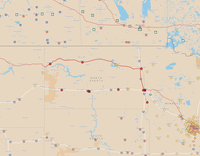
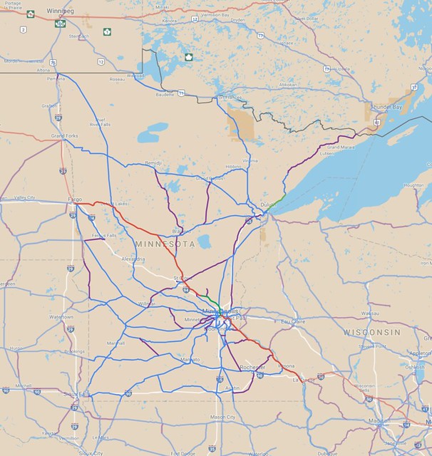
Map of existing passenger train service in North Dakota and nearby areas.

The map above shows the route the Empire Builder takes as it crosses through the region, with markers showing cities of 5,000 people and up. Only 12 cities in North Dakota are that large:
CityPopulation
(2015 est.)
Note
Fargo115,863Served by Amtrak
Bismarck68,896
Grand Forks56,057Served by Amtrak
Minot47,997Served by Amtrak
West Fargo31,771Fargo metro area
Williston24,562Served by Amtrak
Dickinson22,322
Mandan20,820
Jamestown15,446
Wahpeton7,903
Devils Lake7,288Served by Amtrak
Valley City6,676

Amtrak serves five of those cities (Fargo, Grand Forks, Devils Lake, Minot, and Williston) plus two other smaller towns (Rugby, pop. 2,846, and Stanley, pop. 2,721).

The sparse nature of North Dakota is one reason why I used the 5,000-person population as a threshold for making my maps for this series of articles—you need to go that low to get more than ten cities of sufficient size in this part of the country. Remarkably, the twelve cities in that table account for 56% of the people in North Dakota (you only need to go down to number 8, Mandan, to exceed 50%), showing that even heavily rural states still concentrate people into a small number of places.

Incidentally, the encampments of people who have been demonstrating against the Dakota Access Pipeline could add up to another "city" meeting the threshold for my maps. Tribal leaders said that the camps had seen more than 10,000 people, though they're likely shrinking now following the announcement on December 4th that an easement had been denied for the pipeline's final segment. The camps are located along the Cannonball River near where it meets the Missouri River (about halfway between Bismarck and the border with South Dakota).
Map of North Dakota's rail system, from the 2007 state rail plan.
The huge existing freight network in North Dakota provides a lot of possibilities for rebuilding a passenger rail system in the state. Conveniently, the larger cities are mostly laid out along two corridors: The existing Empire Builder line, closely mirrored by U.S. Highway 2, and another corridor heading straight west from Fargo, once operated by the Northern Pacific Railway, now mirrored by Interstate 94.

Northern Pacific operated a few passenger trains on their mainline, one of which was the North Coast Limited, one of the many routes that was discontinued in 1971 when Amtrak took over nearly all intercity train service in the country. However, an "experimental" train service that Amtrak called the North Coast Hiawatha was brought back on the same route later that same year. Unfortunately, it was only a half-hearted attempt, since the train only ran three times weekly per direction for most of its existence (aside for a few peak summertime travel seasons when it operated daily). The line was finally dropped in 1979 after a round of federal budget cuts for Amtrak.

That's likely the best corridor to add back as a passenger line in the state, since it connects several larger communities. Amtrak studied restoring the North Coast Hiawatha back in 2009, something that was mandated under the previous year's American Recovery and Reinvestment Act (ARRA). Of course, no funding for implementation ever followed, so the report is now gathering dust. Nonetheless, it gives some guidance as to what the challenges would be for bringing back service along that corridor.

Restoring passenger trains on the line would reconnect Fargo to Valley City, Jamestown, Bismarck, Mandan, and Dickinson, and it would be worth considering having it head south from Fargo to reach Breckenridge/Wahpeton to completely reconnect the state's larger towns.

However, it would be best to go beyond simply adding that second route through the state. Today's Empire Builder only serves Fargo and Grand Forks in the extreme early morning hours, and Amtrak's North Coast Hiawatha study also planned to stop in most North Dakota destinations between midnight and 7 a.m., which is not a pleasant time to be arriving or departing. Proper service during daylight hours would be much better for the state.

I think it would be best to add a few more routes to build up a mesh of lines. Below is a map of routes in North Dakota and nearby areas that I think would likely have the greatest chance of success, if proper investments were made and trains ran a few times a day, and not just at night or early in the morning:

nd-combined-2-full-cities by Michael Hicks, on Flickr
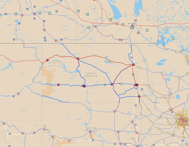
A map of suggested improvements in North Dakota. Zoomable version.


If there were only the two east-west routes, people wishing to travel from Bismarck to Minot (for instance) would have to circle all the way through Fargo and Grand Forks, or possibly go west to somewhere in Montana in order to make a transfer. However, there are some decent options for shortcuts that could be considered.

On this map, I included a route from Jamestown to Minot which would help with that situation. Transferring in Jamestown would shorten a Bismarck–Minot trip by about 210 miles. There's also a rail line heading almost straight north from Bismarck and nearly reaching Minot, but it falls about 27 miles short. Filling in that gap would shorten a Bismarck–Minot trip by over 340 miles.

I also tried to make a few reasonable guesses as to what might work for cross-border lines into South Dakota and Canada. Much of South Dakota's population is in the eastern 1/3rd of the state, so it makes the most sense to try and run lines south from Fargo, Wahpeton, and Jamestown. However, significant pieces of the lines that formerly ran north and south have been abandoned, so they would be more costly to bring back.

A former transcontinental route built by the Milwaukee Road cuts through the southwestern corner of North Dakota. That's a fairly low-population route, and would probably be a low priority, but it would help connectivity through Aberdeen, South Dakota, that state's third-largest city.

Fargo and Grand Forks line up well for facilitating a corridor toward Winnipeg in Manitoba. Unfortunately, a short stretch of track that used to run straight into Canada near Pembina, ND has been abandoned. I included a suggestion in the map to build a short new connection via the existing border crossing between Noyes, Minnesota and Emerson, Manitoba. Reaching Winnipeg would allow a connection to Canada's passenger rail system, such as it is. Two services currently operate to and through Winnipeg: Via Rail's Toronto-to-Vancouver Canadian and the Winnipeg-Churchill train, which ends in a small town far north on the shore of Hudson Bay. Those services only operate two or three times per week, however.

Further west, Canadian Pacific has a mainline connection running from Minot northwest into Saskatchewan. The line heads toward Moose Jaw, though building a stretch of connecting track to another parallel line about 30 miles away could redirect trains to the provincial capital of Regina, a significantly larger destination.

Finally, one major disadvantage with the existing freight network in North Dakota is that it's primarily designed for feeding agricultural products east and south toward the Twin Cities and Chicago. There aren't many lines that that cut against that grain. I included a suggestion for a line running northeast from Jamestown, which could shorten journeys for people traveling from Bismarck to Grand Forks, for instance, without forcing a transfer in Fargo. However, a route like that would probably be among the lowest priorities for anyone wishing to rebuild a passenger system in the state.

The Empire Builder runs a little over 420 miles through North Dakota. Adding back the North Coast Hiawatha route would add another 374 miles to the roster of active passenger track in the state. All told, my suggested network would add another 939 miles of service along existing track, plus building or restoring tracks along another 194 miles. Along with the existing Empire Builder, that adds up to 1,554 miles. If it were all built, that mean that about 42% of the state's rail network would be supporting passenger service, compared to just 12% today.

Clearly, the biggest bang for the buck would come from restoring service straight west from Fargo along the old Northern Pacific corridor. Amtrak's study from 2009 looked at the whole 2,200-mile route and estimated it would cost a bit over $1 billion to restore once-daily train service over that whole distance (including about $330 million for new train equipment to run over the tracks). That's a heartburn-inducing figure, but things become very costly when talking about such huge distances.

The Dakota Access Pipeline provides an interesting point of comparison, since it is estimated to cost about $3.7 billion over a 1,172-mile route. It is a very different thing from a railroad, but it makes me wonder what we could achieve if similar amounts of money were put into passenger service or improvements for existing freight trains. For instance, $3.7 billion would probably pay for converting 1,500 to 2,000 miles of railroad to electrified service, allowing a substantial number of diesel locomotives to be retired and replaced with more efficient, emission-free units instead.

Hopefully we can turn a corner soon and focus more on moving people rather than petroleum. It's something of a long shot in today's political climate, but something worth thinking about. North Dakota's rail network also seems oversized for a place with its population, so it is a good idea to think about which routes are most important for preservation going forward. There have been many missteps in recent decades where good routes have been prematurely abandoned, so it would be wise to learn from those mistakes and try to make better decisions for the future.

Thursday, November 3, 2016

Prospects for passenger rail in Wisconsin

In my most recent two posts, I looked at the opportunities I see for passenger rail in Minnesota followed by an entry examining Norway's passenger rail network to make some comparisons. There are similarities such as the fact that Minnesota and Norway have about the same population and have been growing at about the same rate. Norway has a much bigger and healthier system of passenger train lines than Minnesota does, although we here in the Midwest have far more overall rail mileage installed due to the vast number of freight lines that were built back in the late 19th and early 20th centuries.

This time, I thought I'd turn to our neighbor, Wisconsin, and see what opportunities might exist there. In the 1990s and early 2000s, Wisconsin had been one of the states pushing for expanded passenger rail service in the Midwest, notably leading the Midwest Regional Rail Initiative which was planning several lines radiating out of Chicago which would operate at speeds up to 110 miles per hour.

A couple of these have come to fruition to some extent, such as Amtrak's Chicago–Detroit and Chicago–St. Louis corridor. However, an enhanced-speed extension of train service from Milwaukee to Madison in Wisconsin was canceled after the election of Scott Walker in 2010, and prospects for extending that all the way to the Twin Cities have largely evaporated aside from plans for a second daily train along the route. Even that straightforward idea has taken way too long to be implemented.

Here's a map of existing passenger rail in Wisconsin:


The service that exists today in Wisconsin is very similar to what Amtrak has offered there ever since it was created in 1971. The number of passenger trains per day on the Hiawatha service between Milwaukee and Chicago has increased, but west of Milwaukee, there's only one Empire Builder per direction per day. Chicago's Metra commuter train system also has a little bit of service in Wisconsin, but it only extends about seven miles into the state, ending in Kenosha.

Amtrak operates on only 236 miles out of the state's total of more than 3,600 miles of track—a mere 6.5% of the state's overall rail system.

As in my previous maps, I've included markers for all cities of 5,000 residents or larger. Wisconsin has a population that's a bit more spread out than in Minnesota. Most people in Minnesota live in the Twin Cities region (about three million people), but Milwaukee's metro area is not quite as big (only about two million). The state's largest cities are a more widely distributed, which in a way makes the state better suited for supporting an intercity public transportation network.

Here's a concept map I made that could be used to connect all of Wisconsin's cities of 5,000 and up into a rail network. About ten cities were on abandoned lines or had never been connected to the state's freight network, and those are on lines drawn in purple, indicating that they're on corridors that need to be restored or built new. Blue lines indicate track that is still in active use for freight which I think could have value for passenger service:


Here's a zoomable version of the Wisconsin portion of that map.

That's just one idea out of many possible route combinations for the state, which could grow larger or smaller depending on how things get prioritized. Some of the best corridors on the map include the ill-fated extension to Madison (which would have branched off from the Empire Builder corridor in Watertown) and a route from Milwaukee to Green Bay via the west coast of Lake Winnebago, hitting Fond du Lac, Oshkosh, and Appleton along the way.

An extension of the Metra corridor along the shore of Lake Michigan from Kenosha through Racine to Milwaukee is another no-brainer, and probably something that would have been implemented by now if not for the political machinations of the last decade. A few other radial Metra lines could logically extend into southern Wisconsin heading in the direction of Janesville and Milwaukee's southwestern suburbs and exurbs.

The Milwaukee area retains a fairly robust system of rail lines which could be used for commuter-style service. Madison also has a good potential for lines radiating out, though a few of those have been abandoned over the years. Janesville, the home of U.S. Speaker of the House Paul Ryan, doesn't have that many suburbs in its immediate vicinity, but it turns out to be a natural crossing point for a number of lines between other places, and could be a significant passenger rail hub someday.

MnDOT has plans for a regional train service from the Twin Cities to Eau Claire, though it's hard to say when that might move forward. That line could be extended southeast to combine with the existing Amtrak corridor to Milwaukee (owned by Canadian Pacific), though another line toward Appleton and/or Green Bay would also be a good option.


Finally, I'll mention that Wisconsin has ferry services operating on two routes across Lake Michigan. They run from Milwaukee and Manitowoc on the Wisconsin side to Muskegon and Ludington on the Michigan side, respectively. Milwaukee already has passenger rail service, but the other three cities would benefit from being connected to the rail system as well.


Surprisingly, a substantial amount of Wisconsin's rail network is either owned by the state or by other public agencies (primarily shown with outlined orange lines in the above map). Most of this publicly-owned network is operated by the Wisconsin & Southern Railroad, including the segment between Watertown and Madison which was set to be upgraded for higher-speed service when the plug was pulled in late 2010. Bizarrely (to me, anyway), the CEO of Wisconsin & Southern found to have been illegally funneling campaign contributions to Scott Walker's campaign in the 2010 election, thereby helping to torpedo the $810 million project that would have directly benefited his railroad. I'm not sure I'll ever wrap my mind around that one.

Wisconsin is fairly well-positioned to take advantage of its rail network for passenger service, if only politics could get out of the way. Hopefully things will change sometime soon, but it's hard to predict when that might happen.

As in Minnesota, Wisconsin's rail network has been shrinking for nearly 100 years since the peak of rail travel back in the 1920s. Many of the lines that were abandoned were deservedly dropped, but some of those lost corridors should have been retained for passenger operation even if they didn't carry much freight. The system is at a much more financially sustainable size now, and is probably close to bottoming in terms of overall mileage, but there's still the potential for critically important segments to be abandoned. That's one reason why it's important for the state to step in and help coordinate the maintenance and use of what is still in place and protect them from being lost to future generations.

Wednesday, October 5, 2016

Lessons from Norway for passenger rail in Minnesota

A Norwegian State Railways train near the town of Støren on the line to Trondheim. (Image from Wikimedia Commons, by Sveins, CC-BY-SA 3.0)
When talking about expanding passenger train service in Minnesota and other parts of the U.S., it's common to be told that our area of the country has cities that are too small and spread out for it to ever work. Supposedly, only the Northeast and a few other heavily-populated areas have the population and travel demand to support passenger rail. We certainly don't have the same densities as France, Germany, or Japan, but I had a feeling that there are parts of the world are much more similar to Minnesota or other parts of the Midwest, yet have successful rail systems.

I started searching for such places earlier this year, initially looking at our nearest neighbor, Canada. Unfortunately, it turns out that Canadian passenger rail policy has produced a worse overall result than what we've seen here (Via Rail has a network that pales in comparison even to our skeletal Amtrak system, something I hope to delve into in a future article). Eventually, I turned to Europe to see what I could find over there, and discovered that Norway's fits our situation pretty well.

Norway is an interesting place to compare, especially since a sizable chunk of Minnesota's population is descended from people who migrated here from Norway or other Scandinavian countries. (Of course, it's about twice as common for a Minnesotan to be of German heritage rather than Norwegian.)


It turns out that Minnesota and Norway have had similarly-sized populations for the last several decades, and have been growing at similar rates. In fact, Minnesota passed Norway's population around 1981, when Minnesota reached a population over 4.1 million. However, Norway is a lot larger than our fair state: 149,000 square miles (385,000 km2) of land, 1.7 times our 87,000 sq. mi. (225,000 km2). Since Minnesota has a somewhat bigger population, we have an overall density 1.9 times that of Norway.

The country's shape is stretched out compared to our state borders. Most of it is narrower than Minnesota, but Norway is about 1,150 miles end-to-end. Since Minnesota is about 400 miles north-to-south, you'd need to stack nearly three Minnesotas on top of each other to reach Norway's northeastern edge.

If our area can't justify the existence of passenger trains, then surely it doesn't make sense for Norway to have any, right? But in fact, they have a system that is widely used. Here's a map of Norway's passenger rail network along with major cities (5,000 and larger) and other significant municipalities (kommunes):

norway-rail-existing-cities-2016-10-04 by Michael Hicks, on Flickr

Here's the same map with the city markers removed so the lines can be seen more clearly:

norway-rail-existing-nocities-2016-10-04 by Michael Hicks, on Flickr

(A zoomable version is available here.)

The main rail network extends from Bergen and Stavanger in the western part of the country eastward through Oslo and into Sweden, along with two lines that run north from Oslo toward Trondheim. From Trondheim there's one line that extends to Bodø, which lies north of the Arctic Circle. A short stretch of track also connects the city of Narvik even farther north, though the only way to get there by rail from other parts of Norway is to go through Sweden.


Minnesota only has Amtrak's Empire Builder (one daily round-trip) and the Northstar commuter train (six daily round-trips) providing passenger service on the state's intercity rail network, which only adds up to 800,000 or so annual riders (Northstar had 722,600 riders in 2015 according to the APTA, and Amtrak recorded 138,631 boardings+alightings for the year, but that double-counts some people and doesn't count others who rode straight on through). As I mentioned in my previous post, I noted that we only see regular passenger trains operating on about 375 miles (600 km) out of the state's total 4,444 miles (7,152 km) of track.

Minnesota's rail system grew dramatically from zero miles of track in 1860 to nearly 9,300 miles (14,970 km) in 1920, when the system reached its peak size. Since then, nearly 5,000 miles have been abandoned. Norway's rail system is fairly small in comparison: At 2,540 miles (4,087 km), it represents just over half of the trackage than we lost over the last century. Despite that, they strongly outperform us when it comes to moving people around by rail.

Norwegian State Railways (NSB, for Norges Statsbaner) provides most intercity and commuter train service in Norway. In 2015, they carried 67.1 million passengers on trains within the country, plus another 5.3 million across the border on routes that connect to major cities in Sweden. Their in-country ridership is about 80 times the level we see here. NSB also turned a profit in the process.

NSB also operates a companion bus network, primarily under the Nettbuss name, which serves intercity and commuter passengers, though they also operate the local bus services in some cities. This bus system contributed another 75.3 million to the total number of passengers NSB carried in 2015.

Norway's rail network grew at a much more deliberate pace than the system in Minnesota, perhaps due to the country's challenging topography. Steep mountains force most population and infrastructure into the valleys between them and around the edges of lakes and fjords. However, Norwegians have become adept at using tunnels and bridges to make their own paths through the mountains and across large bodies of water. For instance, there are nearly 700 rail tunnels in the country, many of which are several miles long. Minnesota has very few rail tunnels, perhaps only a dozen, and they're mostly very short (the longest in the state are the Blue Line's tunnels at MSP airport, and that's outside of the scope of this article since that's an urban light rail line rather than an intercity service).

It took until 1909 for the line from Oslo to Bergen to be completely built, a major accomplishment for the country at the time. The pace of growth picked up after the country was invaded by Nazi Germany during World War II, as the new regime saw military advantage in having an expanded system and were willing to exploit the labor of prisoners of war to do it. The southern line to Kristiansand and Stavanger was completed in 1944, and the northern line from Trondheim toward Bodø was significantly expanded during the war. It finally reached that city in 1962 (passenger service included), a time where American railroads could hardly kill off their passenger and freight lines fast enough.

The country has continued to invest since then, including electrifying nearly 2/3rds of the rail network and adding new tunnels to straighten out and speed up older routes that used to skirt around major obstructions. You can see how old and new tunnels mix together on the Bergen Line for yourself, since the state TV broadcaster (NRK) created a "slow TV" recording of the entire 7-hour journey from Bergen to Oslo:


The train in that video operates as an express service near Bergen and Oslo, only stopping at major stations in those areas, but it makes many stops on the stretch between Myrdal and Hokksund. Despite that being a sparsely-populated region compared to the coasts with few larger towns, there are often significant numbers of passengers getting on and off at the stations. Some stretches of the Bergen Line have top speeds of 100 miles per hour (160 km/h), though most of it twists and turns enough that those speeds aren't regularly achieved.

The vast majority of Norway's rail system carries passenger traffic in addition to freight. Generally speaking, only short branch lines off of their mainline network (often just 10 to 20 miles in length) have been abandoned or converted to freight-only use, a stark contrast to what we see in the U.S. They also operate passenger trains more frequently. For instance, there are five round trips per day* on the 308-mile (496 km) route between Oslo and Bergen. A similar journey here might be between the Twin Cities and Green Bay (about 280 miles or 450 km).

*(Technically, only four trains go all the way to Bergen—one round-trip has its western endpoint in Voss, but there are 21 trains running from Voss to Bergen each weekday.)

There are seven round-trips on most days between Oslo and Stavanger (339 miles or 545 km), four round-trips between Oslo and Trondheim (340 miles or 548 km), and two round-trips between Trondheim and Bodø (453 miles or 729 km. A third daily train goes about 2/3rds of the way, to Mo i Rana).

In addition to those longer-distance services with their handful of daily trips, many of Norway's larger cities have shorter-distance local services running much more frequently. Oslo, which has a population of 658,000 and is in a metro area of 1.7 million people, has the biggest commuter rail network, but Bergen (pop. 250,000), Stavanger (211,000), Trondheim (175,000), Skien/Porsgrunn (92,000), and Bodø (40,000) all have more frequent local trains connecting them to towns along the lines that operate to/through them, sometimes up to distances of about 100 miles away.

That gives me a lot of optimism that there's unexploited potential in much of the rail system in Minnesota and other parts of the U.S. Of course, there are a lot of differences between our region and Norway which could throw a monkey wrench in the works. Cars are more expensive to buy and operate in Europe than they are here, and we have a much bigger network of freeways and other major highways than Norway does. But our region is pretty flat, meaning most ordinary rail lines are much straighter here than over there, and could sustain pretty high speeds if they were just rehabilitated and maintained to the right standard.

mn-combined-full-cities, by Michael Hicks, on Flickr
From my previous post, a map of a potential system for reconnecting cities of 5,000 people and up in Minnesota and neighboring states/provinces.

Could we ever get to the level of carrying 67 million passengers a year over the existing freight network here? It would be a big challenge, to be sure, but we can definitely create something better than what exists today. Nearly all of the cities in our state over 5,000 people (which account for 70% of the state's population) are on or near the freight network, and those same lines go through many smaller towns that could also be served. Even if we just set up a core system of rail routes and used buses for many of the connections to smaller towns, we'd probably be a lot better off than we are now.

We have a network already in place that's much more extensive than the Norwegian system. Many northern cities don't have train service, and some cities are on islands that are hard or impossible to reach with ground transportation. In fact, Norway has one of the biggest air travel markets in Europe relative to its population, since many people don't want to deal with the relatively slow, constantly curving routes of roadways and rail lines. People traveling by car also often need to use ferries to reach between islands and fjords, which further slows down journey times. Our flatter region isn't nearly as difficult to build through.

The world recently passed a milestone where carbon dioxide is now saturating the atmosphere at a level of 400 parts per million, and it's continuing to rise year over year, right along with global average temperature. To hold back that rise, we'll have to do everything we can to shift people to using less carbon-intensive modes of travel. Biking, walking, and urban transit are good for local journeys, but it's necessary to build up a good public transportation network for spanning the larger distances between cities too. We have an untapped resource sitting on the ground, and I hope we start using it to it's fullest potential.

Monday, August 22, 2016

A broader look at passenger rail opportunities in Minnesota

I've spent a lot of time on mapping projects over the past several years, focusing in particular on rail lines through Minnesota and nearby regions. Since the state and national rail networks peaked in the 1920s, and have been shrinking ever since, a lot of that mapping has been a bit depressing. There have been a number of times when I've gone into OpenStreetMap to mark once-busy line as as disused, abandoned, or completely obliterated with virtually no trace left behind.

The size of Minnesota's rail network has been roughly cut in half since since its 1920s apex, but there are still 4,444 route-miles of existing railroad in the state, according to MnDOT. That's almost five times the size of the Interstate highway network in Minnesota (916 miles) and a bit over a third the size of the total trunk highway system (11,814 miles including Interstates, U.S. highways, and state highways, though that's still a tiny fraction of the 143,000 total miles of roadway within the state).

mndot-freight-rail-poster-2015-january by Michael Hicks, on Flickr
MnDOT's freight rail map from January 2015. Active lines are in color or black, while abandoned corridors are shown in dashed gray lines.

However, even though Minnesota's 4,444-mile network reaches most of the places you've heard of and many of the ones you haven't, only about 375 miles (about 8%) of it is used for intercity passenger trains. Over 90% of the system is only used for freight traffic.

Here's a map I created to show what we have for existing conditions for passenger rail in Minnesota and nearby areas. This primarily shows Amtrak's Empire Builder, but Via Rail's Canadian is also shown passing through Manitoba and Ontario to the north. I mapped a green segment coming out of Minneapolis showing the Northstar Line, and I also included a line out of Duluth for the North Shore Scenic Railroad (You can't really go anywhere on that line, since they're just excursions out and back from the Duluth depot, but it's probably the most significant other rail segment in the region that regularly sees passengers travel over it).

mn-combined-existing-nocities by Michael Hicks, on Flickr

Here's the same map, but including markers for cities with populations of 5,000 or more (Stars denote capital cities, squares are used for the largest cities per state, and circles mark either the 10 largest cities per state/province, or cities over 75,000 when the state/province is large enough, such as with Thunder Bay in Ontario. Smaller places are noted with orange or yellow diamonds):

mn-combined-existing-cities by Michael Hicks on Flickr

The national Amtrak passenger rail system is an extremely skeletal network that sometimes has gaps of hundreds of miles between corridors, and most of the system only sees one train per day per direction.

We're relatively lucky that Amtrak even stops in the Twin Cities. To our south in Iowa, Amtrak misses the state's capital and largest city, Des Moines, by about 50 miles. The most-populated place in Iowa directly served by Amtrak is Burlington, the state's 19th-largest city. (Iowa's 7th-largest city, Council Bluffs, gets an honorable mention since it is a suburb of Omaha, Nebraska, where Amtrak does have a station.) To our west, Amtrak doesn't even bother serving South Dakota, even though the Sioux Falls region has a population of about 250,000 and Rapid City, near the Black Hills, has a metro population of 144,000.

Even though Amtrak only has six stops in Minnesota (Detroit Lakes, Staples, St. Cloud, Saint Paul, Red Wing, and Winona) and three others just across the border (Grand Forks and Fargo in North Dakota and La Crosse in Wisconsin), they can easily claim to serve more than half the state's population, simply because the 3.1 million out of the state's total 5.5 million population is concentrated in the Twin Cities region. I think we deserve a lot better than that, though.

Places like Rochester (3rd largest city in the state after Minneapolis and St. Paul) and Duluth (5th place, barely behind Bloomington) have no service, not to mention numerous other smaller towns.

One of my observations during my years mapping is that most places with populations of 5,000 and up still have freight rail service. This isn't always true, but the rule holds pretty well for outstate Minnesota. From what I can tell, the only towns of that size outside of the Twin Cities lacking freight rail are Hutchinson (pop. 14,000, about 60 miles west of Minneapolis), and Stewartville (pop. 6,000, about 13 miles south of Rochester).

There are more examples within the Twin Cities, particularly postwar suburbs, but even most of them are still within a few miles of railroad lines due to the denser network of tracks in the metro area. Woodbury, the state's 9th largest state (pop. 68,000), is the biggest to not have direct rail service, but its neighboring cities of Oakdale and Lake Elmo do have tracks running through them.


I decided to try making a map to show how much of the state and surrounding area could be linked using existing track, and how much might need to be rebuilt or constructed on new alignments in order to make a suitable network. You might call this a "fantasy map", but I prefer to think of it as a "mapping experiment", since it's mostly based around infrastructure that already exists.

Here's what I came up with (still somewhat of a work in progress). Existing freight lines are marked in blue, while purple is used for routes that would need to be built new or reconstructed:

mn-combined-full-nocities by Michael Hicks, on Flickr

Here's the same map again, but with cities included:

mn-combined-full-cities, by Michael Hicks, on Flickr

The system that emerged in my map adds up to about 4,275 miles within Minnesota's borders, including 3,475 miles of existing railroad (78% of the state's freight system) and adding or restoring about 805 miles of other corridors to create a tighter mesh. If all of that was built for passenger service and other existing freight lines were retained, this would re-grow Minnesota's overall rail network by about 18% to 5,250 route-miles.

Most of the purple routes follow abandoned rail lines, but a few, including connections for the off-network towns of Hutchinson and Stewartville, plus segments of the line to Thunder Bay, Ontario, use alignments that I invented.


My population threshold of 5,000 was fairly arbitrary—it's probably a lower population than most transportation planners would think of connecting by rail, but cities of that size can still generate quite a bit of traffic.

My hometown of Byron is currently estimated to have a population of about 5,300 people, and according to the Census's OnTheMap tool, 1,785 people who live in Byron are employed in nearby Rochester. If each one of those people decided to drive to work at exactly the same time, the line of cars would be nearly 7 miles long standing still and would stretch to 100 miles if they were moving at 65 mph with a 3-second trailing distance—not so good considering that Byron and Rochester are only 10 miles apart. Plus, that's purely a measure of commuter traffic—there are always additional trips for dining, shopping, and other activities to consider too.

I wish there was more transportation thinking happening on this scale, since I think it would massively improve our chances of meeting climate change goals in the transportation sector. If this network existed, it would be much easier to have a car-free or car-lite life, even in a rural small town. Cities of 5,000 and up account for 70% of the state's population, and an extensive network like this would also dramatically improve public transportation access for the remaining 30%.

MnDOT has a passenger rail plan with some of these routes included in it (the image below is from the 2010 version of the plan), but their system always struck me as a bit flawed since it was entirely centered on the Twin Cities and it didn't give much priority to the lines to Sioux Falls or straight south to Albert Lea (toward Des Moines). The latter line has since been upgraded to a higher priority, but that's not saying much considering the slow pace of planning for these routes.


In my opinion, MnDOT's passenger rail plan is the minimum we should be aiming for, but they've had insufficient financial and personnel resources to even execute that vision. Their plan would reach most cities over 20,000 in population (at least outside of the metro area), but for now it remains little more than an idea.

Planning for the Northern Lights Express service to Duluth continues to trundle along, though the planned speed and frequency of service has been cut back. Formerly fast-moving plans for high-speed service to Rochester have been shelved due to lack of funds and the emergence of a private company that claims they'll build the line instead, but it's not clear whether that organization will move forward either.

It's been like pulling teeth to get any movement on a mere second daily train between the Twin Cities and Chicago, and plans for faster and more frequent trains on that line have been held up because of an obstinate government in Wisconsin.

Something significant has to be done to shake us out of the rut of car-dependent transportation planning across the state. In a previous post, I suggested implementing a statewide 1% sales tax that could be applied to both urban transit and intercity projects like this, estimating that it could generate about $740 million per year, enough to fully fund the equivalent of at least one 150-mile Northern Lights Express project annually.

It would take a few decades to build out a system as big as what I've suggested, and such a scale might not be fully attainable given future lifecycle costs, but some back-of-the-envelope calculating suggests revenue from a 1% sales tax (assuming about half of that went to urban transit and the other half was for intercity links) would make it possible to build out and sustain a system of at least 2,000, putting it somewhere in between MnDOT's suggested system and my concept.

What do you think? Where would you draw the line for intercity service?

Friday, May 20, 2016

Taking the "transit" sales tax statewide

As I write this, the 2016 Minnesota legislative session is coming to a close, and last-minute discussions are taking place to try and sort out transportation funding. One of the major options is the possibility of a 0.5% metro-area sales tax for transit, an increase from the 0.25% currently collected for the Counties Transit Improvement Board. This is partly to finance the Southwest LRT project, which is currently facing a $135 million funding gap. CTIB currently collects $110 million per year, and the increase would bring the funding level to $280 million annually (if it included all 7 counties rather than the 5 that are currently members).

That's a significant improvement, but still pales in comparison to the annual amount of money put into roadways. In 2015, MnDOT funneled $3.28 billion in funds. That included about $1.3 billion on construction for roads and bridges on the state trunk highway system, plus another $1 billion handed over to counties and cities for the County State-Aid Highway (CSAH) and Municipal State-Aid Street (MSAS) programs.

When discussing transit funding, it's common to get bogged down talking about operational costs, even though that is measuring something completely different than the capital spending that dominates the cost of roadways. MnDOT doesn't actually move anyone—they just provide the infrastructure that allows people to move themselves, mostly in cars that are privately owned. Capital spending by transit agencies tends to be fairly low, and it's often dominated by the cost of vehicles and maintenance facilities, with little left over for any actual infrastructure in the ground. New rail projects have all-inclusive budgets that seem high because they count guideways, vehicles, stations, maintenance facilities (which double as parking for transit vehicles), power supplies, and miscellaneous other items.

Given all of that, it's really unsurprising that the mode share for public transportation is very low across the country, and only modestly better in most larger metro areas. But wow, wouldn't that be different if we balanced the amount of spending between different modes? What if we had the money to fund the tunneled and/or elevated lines that would allow denser parts of the Twin Cities to have good transit service? What if we built on the concept of the metro-area sales tax and took that statewide?

This topic has come up over on the streets.mn forum, with a few different ideas tossed around, and some more thoughts have bubbled up as we now watch Denver open several new lines this year, starting with the new A Line commuter service to their airport.

The Twin Cities region has long struggled to fund desirable projects, and it has been especially difficult to get lines with good routings to serve the densest and most populous parts of our region. Minneapolis, which generates the largest number of transit trips of any city in the metro area, is only expected to be served by a limited number of new light-rail stations on the Blue and Green Line extensions.

Of course, if we had a steady stream of $1 billion per year like the trunk highway system does, what has been impossible in the past due to complex federal funding rules would now be far, far more practical. It would be easier to do the logical thing and upgrade Metro Transit's busiest routes.


If we took the funding stream statewide, it would also help transit service in smaller cities, and could fund the restoration of passenger service on current and former freight rail corridors across the state, not to mention a conversion from diesel power to quieter, cleaner, and more efficient electric power. This would make it so "transit" isn't just something for large cities, but also a system for connecting all corners of the state. Most towns in Minnesota were built up along rail corridors, so it would make sense to link them together again. MnDOT has struggled to make progress on the estimated $95 million second daily train to Chicago, a project that should have been implemented years ago. That project and MnDOT's state rail plan are things that could be built up in no time if we treated public transportation the same way we treat highways.

Denver's metro-area transit system is funded with a 1% sales tax, double what is currently being discussed by legislators. Minnesota has a pretty large economy, with a gross domestic product of $317 billion in 2014. Each percent of sales tax from that year brought in about $740 million in revenue. Surprisingly, my hypothetical target of $1 billion isn't that far off. If we wanted to do this, we could.

Are either of those figures the right amount to spend on public transportation in our state? For our present situation, where highway funding has been leagues ahead of what we've gotten for transit decade after decade, it basically seems too low. We can't flip the switch tonight and have a fully built-out statewide system tomorrow, but with issues like climate change lurking, and a possible flip from growth in the sprawling suburbs back into the city grid, I feel like we need all the investment we can get.

Monday, May 9, 2016

Getting around the block: Metro vs. outstate

blocks-rochester-2016-03-23 by Michael Hicks, on Flickr
A map of city blocks in Rochester, Minnesota (Click here for full map).

In my last few articles, I've looked at the city block layouts of Minneapolis and Saint Paul (both downtown and citywide) and compared them to a few suburbs. I thought it would be useful to also make some comparisons with cities outside of the metro area, to see what they're like.

Above, I have a map of Rochester, which about 80 miles southeast of the Twin Cities. It's the third-largest city in the state, after Minneapolis and Saint Paul, but is quite a bit smaller than those two. The most recent population estimates put Rochester at about 111,000 residents, which is roughly 27% the size of Minneapolis (pop. 407,000) and 37% the size of Saint Paul (pop. 298,000).

As with previous maps in my series, I've drawn blocks using surface streets (skipping freeways) and given them colors according to size and the presence of one-way streets around the edges. Pink blocks are 15 acres or larger, while green, yellow, and darker red colors are used when blocks are smaller in size. I use green for blocks that can be circled clockwise, while yellow blocks need to be circled counter-clockwise due to one-way streets. Red blocks crop up when one-way streets meet and it's impossible to loop around the block without also including another adjacent block.

The resulting maps tend to show where I find it to be comfortable or uncomfortable to walk around, at least in terms of time and distance. A square block of 15 acres is about 0.6 miles and takes at least 12 minutes to circle on foot, and those figures increase as blocks become longer and thinner, or become twisted around into strange shapes.

I let the blocks continue beyond the city borders until reaching the nearest street roadway that could complete a loop, so the Rochester map bleeds over into unincorporated territory quite a bit.

It's useful to compare this map to Minneapolis, which is the most walkable city in the state, along with being the one with the highest transit ridership:


A map of city blocks in Minneapolis. Click here for full map.

It's a pretty stark difference between the two. I traced 4,701 small blocks in Minneapolis compared to 225 large blocks, for a ratio of 21:1. In Rochester, I traced 922 small blocks versus 256 large blocks, for a ratio of just 3.6:1.

Perhaps a better measure is number of blocks per unit area: Minneapolis has about 90 blocks per square mile, while Rochester has less than 22 per square mile. By either measure, Rochester is much more of a sprawling city than Minneapolis, although it's roughly on par with the suburb of Bloomington, which I looked at in my most recent post.

Rochester had a somewhat larger population than Bloomington before suburban-style development took hold, with around 30,000 residents in 1950. That was enough to create a decent gridded area in the city center, even if it was broken up somewhat by a fork of the Zumbro River that flows through town as well as some of the streams that feed it. The city has a reasonable downtown, but suburban-style sprawl has defined most of the growth since 1950.

In fact, one of the more notable monuments to the suburban style of living and working sits on the north side of the city along U.S. Highway 52—the IBM complex designed by architect Eero Saarinen. Both of my parents worked there as I grew up:

IBM Rochester in the late 1950s by Michael Hicks, on Flickr
IBM's Rochester facility as it appeared around 1958, by Balthazar Korab.

The building's signature blue panels made for an evocative connection between the earth and sky, especially when combined with the landscaping of the site, but the low-slung nature of the two-story complex means that it spreads across a vast area.

It was laid out on a flat plain in a modular design, which made expansion easy, though of course the land area was consumed by parking lots just as rapidly as it was by buildings. The site grew over the years to more than three times the original size (most recently reported at about 3.6 million square feet—a little over half the size of The Pentagon, but more than 2.5x the size of the IDS Center).

IBM Rochester from the air in the late 1950s, on Flickr
The IBM complex as seen from the air around 1958. It has since expanded to about three times the size. Photo by Balthazar Korab.

However, the site is now long past its peak employment, and the amount of hardware manufactured at the site has plummeted. This past week, IBM announced that they would be selling off two-thirds of the site, returning to a footprint similar in scale to what the company originally had in 1958.

A counterpoint to the suburban development by IBM and countless smaller businesses has been the Mayo Clinic's more concentrated development in the city's downtown, though that has unfortunately become surrounded by one of the most distinctly donut-shaped parking craters I've ever come across.

What will Rochester's future hold? There's a lot of momentum for the suburban style of development, especially for housing and retail. Big-box retailers continue to plop buildings down in the middle of empty areas, such as at the "Shoppes on Maine" district on the southern end of town, or the site of the new Menards at the extreme northern edge.

Still, the city's Destination Medical Center project, which aims to build on the success of the Mayo Clinic, is mostly focused on areas in and near downtown. This may restrain sprawling development to some extent, but it seems likely that housing and commercial developers will still seek to spread out onto the cheapest land they can find.

Next, I thought I'd swing my view in the opposite direction and look at Fargo, North Dakota, about 240 miles northwest of the Twin Cities and sitting just on the other side of the Minnesota border:

blocks-fargo-2016-03-27 by Michael Hicks, on Flickr
A map of city blocks in Fargo, North Dakota (Click here for full map).

Fargo has an estimated population of about 116,000, just a few thousand larger than Rochester. However, it's squeezed a bit on the west by the suburb of West Fargo and on the east by the Minnesota border and the city of Moorhead. I mapped 1166 blocks and 272 large ones, for a ratio of 4.3:1. That's significantly higher than Rochester's 3.6:1, but still far below Minneapolis's 21:1 or Saint Paul's 14:1.

The street grid spreading out from downtown is more contiguous in Fargo, though there's only one significant river to contend with: The Red River of the North, which defines the border between Minnesota and North Dakota. The grid falls apart as you get close to Hector International Airport in the northwest part of the city, 25th Street heading west, and Interstate 94 heading south.

Rochester and Fargo have been on a similar population trajectory for the past few decades, though Fargo has been developing somewhat more densely. Apartment buildings seem to be much more common in Fargo than in Rochester, though the complexes still tend to be married to large parking lots and are laid out in ways that consume a lot of land, rather than in a more urban pattern facing the street.


Two of BNSF Railway's major routes converge in Fargo and then split apart again on the other side. Despite them passing within blocks of each other near downtown, that part of the city maintains a fairly continuous street grid. However, there is a lot of industrial land centered around the tracks into the western part of the city.


Fargo also sits at the junction of Interstate 94 and I-29, which are also home to many spread-out industrial and commercial sites, including the city's main shopping mall, West Acres (which sits just northwest of the I-94/I-29 interchange). Areas near the interchange also host many hotels, befitting the city's nature as a gateway to the rest of North Dakota.

Further evidence of the city's sprawl is typified by one of my most-/least-favorite ironic place names, lying just southwest of the freeway interchange: The neighborhood of Urban Plains, which is of course neither urban nor plains.

Could Fargo do a proper job of marrying those two ideas in the future? The city's downtown development has been far less intense than in Rochester, but the area's large number of parking lots could give a canvas for a diverse mix of businessessomething different than the medically-focused center that Rochester is trying to make. But for now, just like it's cousin to the southeast, Fargo mostly keeps seeing development pop up well outside the city core.

Both Rochester and Fargo have the population to make them very dynamic places, but the lack of restraint for keeping development compact and connected ends up diffusing a lot of that potential energy. Without big natural barriers, adjacent suburbs, or well-defined urban barriers hemming them in, the cities have had important destinations flung around without any consideration for how people will get there through any means other than by carsomething that can't continue to be tolerated in the 21st century. Here's hoping they start changing their plans.

Monday, April 25, 2016

Getting around the block: City vs. suburb

In my last two posts, I looked at the city block structures in Minneapolis and Saint Paul, first zooming in to the respective downtowns, then pulling out to look all the way to the cities' borders and slightly beyond. Now I'd like to turn to a few suburbs and see how they compare.

First, let's refresh our memories by taking a look at Minneapolis:


A map of city blocks in Minneapolis. Click here for full map.

In my maps, blocks that are less than 15 acres in size are colored green, yellow, or dark red (the latter two colors help indicate the presence of one-way streets). Blocks of 15 acres and larger are shown in pink. That size is roughly when I find that they become uncomfortable to walk around—these blocks have a circumference of at least 0.6 miles and take at least 12 minutes to circle on foot, and those numbers increase as blocks elongate and morph into strange shapes.

Minneapolis is a city of about 407,000 people, and has been getting built up for more than 150 years. A street grid system has been effective at filling out and giving access to most of the city's developable land. Areas shown in green on the map are generally pretty walkable and bikeable, with typical city blocks around four or five acres in size. Not all areas of the city have good access to things like restaurants, grocery stores, or other shops, but there's generally good connectivity, setting up a nice framework to be built upon.

My Minneapolis map has 4,701 small blocks compared to 225 large ones, for a ratio of about 21:1.

Now let's turn our gaze to Eden Prairie, which hangs off the southwestern edge of the I-494/I-694 beltway. It was incorporated in 1962, and has grown rapidly to become a city of about 63,000 people. An abundance of office parks and retail locations mean that close to 40,000 people work in the city, more than 85% of whom commute from other cities in the metro area. Like Minneapolis, most of the city's developable land has now been divided up into fairly small, privately-owned parcels, so it's almost fully built out:

A map of city blocks in Eden Prairie, Minnesota
A map of city blocks in Eden Prairie. Click here for full map.

Um. Yikes!

This map has 328 small blocks and 164 big ones—a ratio of just 2:1, or less than one-tenth the small:big block ratio for Minneapolis.

In a word, this is sprawl. There's a lot more stuff in Eden Prairie than what that map shows, but it's arranged in ways that waste land and make it extremely difficult to get around by any means other than driving. Let's zoom in on a section near Baker Road and Valley View Road to get a better look at what's going on:


Comparing an aerial view of Eden Prairie to a map only showing city blocks.

This comparison image shows how the suburb's dead-end streets and cul-de-sacs fill up space but don't really contribute to street connectivity. Tracing only the block edge filters out most of the streets that are mere fingers into larger areas of land. The gaps between blocks mostly show through streets, though sometimes blocks exist in small pods that are entirely encircled by a larger block except for a single road to access them.

This map highlights how suburbs' heavy reliance on cul-de-sacs, pod-style development, and hierarchical road systems is bad for walkability and bikeability, and it isn't good for car traffic either.

Do you remember how busy things were at polling places on caucus night this year? My caucus site in Saint Paul was at a nearby school less than a mile away, and I was able to walk there in 15 minutes. While a lot of other people drove, the school I went to was surrounded by a pretty good street grid to walk, bike, and drive on. I'm sure there was some frustration with parking, but there were plenty of open spaces on nearby streets as long as people were willing to walk a couple blocks.

In Eden Prairie, by contrast, a much higher proportion of people had to drive to their caucus sites, and the limited number of alternate routes created cases where the traffic stretched on for long distances—perhaps miles:


The sparse road system in suburbs like Eden Prairie funnels traffic onto the few through streets that remain. A system of small streets connected to feeder streets leading to main arterial roads can create traffic jams that could be sopped up by the grid in more traditional neighborhoods.

The limited number of through routes also creates huge problems for transit planners. Buses operate most effectively when they can run on relatively straight routes to and through mixed-use zones. They can only pick up and drop off passengers along the edges of these blocks, unless a special right-of-way or station is built. Buses that run along the freeway can't stop wherever they want—they have to exit the freeway either on a normal off-ramp or using special bus-only access.

Finding a relatively straight route that manages to hit walkable pockets while also reaching relatively dense areas of population and useful destinations is difficult or impossible with this street layout.

In some cases, there are bicycle and pedestrian paths that break blocks up into smaller areas, but they aren't consistently in place from neighborhood to neighborhood. Single-use zoning is the norm, with residential, commercial, and retail spaces kept segregated from one another, so most paths don't really take you anywhere other than the local neighborhood. Such paths may be nice for recreation, but they aren't able to provide a suitable alternative to getting around the city by car.

Alright, enough picking on Eden Prairie. Let's find another point of comparison. How about Woodbury, a somewhat more populated suburb of about 67,000 that lies just one mile outside the city limits of Saint Paul:


A map of city blocks in Woodbury. Click here for full map.

Oof.

Okay, by my measurement, there are 377 small blocks in Woodbury and 200 big blocks, for a ratio of about 1.9:1. That's slightly worse than Eden Prairie, though Woodbury's development remains somewhat restricted by the Metropolitan Council's MUSA urban boundary line. A fair amount of the southern and extreme eastern parts of Woodbury is still farmland, so there's some potential for the ratio of big blocks and small blocks to improve before it gets fully built-out, but only slightly if future development continues in the same way as what has preceded it. The area that has developed within the MUSA boundary seems a little denser than Eden Prairie, but not by much.

Both of these cities have completely rejected the street grid, and there's hardly a straight line to be found anywhere within them, with the exception of section line roads roughly one every mile in Woodbury. (They had little impact on the layout of neighborhood streets between them, though.)

Alright, let's try and find a suburb that's a little more ordered in its development. How about Bloomington, which lies just east of Eden Prairie. It has about 86,000 residents and is duking it out with Duluth for the rank of fourth-largest city in the state:

Map of city blocks in Bloomington
A map of city blocks in Bloomington. Click here for full map.

Aha! Here we have found something of a "missing link" in the transition between cities and suburbs in our metro area. Bloomington is technically an older city in the metro area, as it was incorporated in 1858. However, the number of people living there grew slowly until just after World War II. The population jumped from 3,600 to 9,900 between 1940 and 1950, then exploded to more than 50,000 in 1960 before leveling off at about 82,000 around 1970.

Bloomington lies south of Minneapolis and the inner-ring suburb of Richfield. The Minneapolis street grids extends through Richfield and is present in parts of Bloomington, particularly between Interstate 35W and Cedar Avenue (Minnesota State Highway 77). However, the grid is much more fragmented in Bloomington, and many blocks are considerably larger—essentially two to four Minneapolis-sized blocks merged together.

There's a certain logic to that, since the lot sizes for individual homes also grew as development moved pushed south and west through Bloomington. The most common residential lot size in Minneapolis is about one-eighth of an acre, while houses in Bloomington are typically on lots about two or three times that size. If a block size that formerly contained 30 homes could now only hold 15 or 10, it might make sense to bump up block sizes by a corresponding amount, in order to avoid creating too much infrastructure for too few people.

That alone might not have been so bad, but the city block structure also began to twist, turn, and break apart first as curving streets and then cul-de-sacs became fashionable among developers in the post-war era.

Lot sizes for commercial and industrial businesses also grew, and retailers were often concentrated into strip malls or shopping centers, all of which were major contributors to the weakening of the street grid. Even though many businesses have the same or similar amounts of square footage as comparable ones on smaller parcels in the core cities, they're separated into single-use buildings and surrounded by parking lots.

All of this helps explain why so few people walk, bike, and take transit in the suburbs as compared to Minneapolis. The idea of a standard city block is completely alien in these areas, and people can live their whole lives without really understanding what it's like to live in a true neighborhood where it's possible to live, work, eat, shop, and do most other things without needing to get on a highway.

As Nick Magrino noted in his Measuring the Metro Area and Getting Real with the Map piece, only the core cities and a limited set of the suburbs can be considered "urban" in a traditional sense. Without the framework of a tight grid or other small-block layout, it becomes nearly impossible to meet or even set meaningful goals for increasing mode share for walking, biking, or taking transit, and it makes it extremely challenging to serve populations like children, the elderly, or those with disabilities who can't move themselves around by car.

While developers have occasionally tried to go back to smaller block sizes in what I like to call "New Urbanish" projects, they are still often isolated in small pods. Going back to the grid is one of the only ways to break developers of their bad habits. But are we already too late?

Wednesday, April 20, 2016

Getting around the block: City vs. city


A map of the city blocks of Saint Paul. Click here for full map.

In my previous post, I compared the city block layouts of the downtowns of Minneapolis and Saint Paul. This time, I thought I'd zoom out and compare the whole cities. Above is the map for Saint Paul, a city of about 300,000 residents. Blocks that are green, yellow, and dark red are smaller in size, less than 15 acres, while pink blocks are larger. That's a fairly arbitrary size to mark a transition between small and large blocks, but generally fits with where I'm comfortable getting around. A 15-acre block is at least 0.6 miles in circumference, taking about 12 minutes to circle on foot, with the time and distance increasing as blocks get longer, thinner, and begin to take on strange shapes.

In general, the map shows blocks of the tightest loop you can make with surface streets to circle around any particular point in the city. Some of these blocks extend well beyond the city borders, so these maps make the cities look a bit larger geographically than what you normally see. To simplify my mapmaking, I generally required streets to have car and bike and pedestrian access, which excluded freeways (illegal to walk or bike on) and made campuses and parks look less permeable here than they would be to someone using non-motorized transportation.

The color coding helps indicate the presence of one-way streets and how they impact navigation by car (usually with the same rules applying for bikes). Green blocks can be circled clockwise, while yellow and dark red blocks have one-way streets on their edges that either require at least one left turn (circling the block counter-clockwise), or have turn conflicts that prevent looping the block.

As I noted in my last post, downtown Saint Paul is relatively isolated from the rest of the city, but a dense street grid reaches through most other neighborhoods, creating large, fairly contiguous regions that are fairly easy to walk and bike around, and that can sop up large volumes of car traffic.

Individual neighborhood "islands" contain scattered large block within them, and are separated from each other by longer corridors. The city's network of highways and railways also fans out from the downtown area through the rest of the city. These tend to run past industrial and low-density commercial blocks, but also sometimes bump into other areas of limited development.

Many large blocks appear because of natural impediments like rivers, lakes, and steeply sloping hills. The Mississippi River valley marks the most significant area of big blocks through the city, with wide river flats areas that are largely un- or under-developed. The West Side Flats area just across the river from downtown is notable for getting its residential population cleared out in the 1960s after flooding devastated the area the decade before. However, the low-density commercial development that replaced it still contributes to downtown's isolation from the rest of the city.

Some large blocks on the map are fairly private spaces like cemeteries and golf courses, while others are more permeable to foot and bicycle traffic, such as parks and school campuses.

The relatively sparse road network on the western edge of Saint Paul creates a large lobe extending well into Minneapolis along BNSF rail corridors.

I mapped out 3508 small blocks and 248 large blocks in Saint Paul, which is a ratio of about 14:1. Let's take a look at Minneapolis and see how it compares:


A map of city blocks in Minneapolis. Click here for full map.

Minneapolis is somewhat larger and denser than Saint Paul, with a population of about 407,000. Regions of small blocks are even more contiguous than in Saint Paul, perhaps aided by the fact that the city is a bit flatter than its neighbor to the east.

Interestingly, the Mississippi River channel is narrower through Minneapolis (the city sits upstream of the confluence with the Minnesota River). It's also a bit harder to see freeways cutting through the city than I would have expected.

One-way streets extend much farther into Minneapolis's neighborhoods than into Saint Paul. Some of these one-ways essentially make highways through town, while others are in place because of narrow streets or heavy volumes of parked cars in denser neighborhoods.

Railroads still cut through parts of the city, particularly in paths radiating to the west of downtown and in through Northeast and Southeast Minneapolis, but they don't have quite the same impact as in Saint Paul. The areas northeast of the Mississippi also host a large amount of industrial land along Interstate 35W and the rail corridors. Surface streets are so limited in that area that the convergence of I-35W, Minnesota State Highway 280 and MN-36 creates a "block" that extends all the way to Fairview Avenue—kitty-corner to Rosedale Center mall.

Similarly, the sparse road network along the I-394 corridor creates blocks that extend well into St. Louis Park and Golden Valley, even reaching past MN-100. That same highway makes a significant barrier on the northeastern edge of the city, so circling on surface streets would take you through parts of the old Brookdale Mall in Brooklyn Center.

Circling the block along the MN-62 corridor on the south end of Minneapolis will take you into Richfield, and a large lobe also extends south of the city to encircle Minneapolis–Saint Paul International Airport, which takes up most of the unincorporated area of Fort Snelling.

When making this map, I was surprised at how many blocks were crammed close to Lake Harriet, Lake Calhoun, and Lake of the Isles. Even areas around Lake Nokomis and Diamond Lake have had a lot of stuff built quite close to them.

Planners in Minneapolis have used the street grid and other small-block layouts to great effect since the city was founded, filling almost every nook and cranny they could find. I count 4,701 small blocks on this map, plus another 225 big blocks—a ratio of nearly 21:1 (significantly higher than Saint Paul's 14:1).

How do you think the suburbs fare in comparison? Stay tuned for a future post.

Monday, April 18, 2016

Getting around the block: Downtown vs. downtown


Map of city blocks in downtown Saint Paul. Click here for full map.

How hard is it to get around the city block where you live, work, or shop? Does that affect the modes of transportation you choose on a daily basis? Does it impact the choices of city planners, or the areas where businesses choose to locate?

Until I started working in downtown Saint Paul, I often avoided the area due to its reputation for getting people lost. There are several one-way streets that create confusion, and the north-south streets are mostly named rather than numbered, so it becomes difficult to keep track of where you are unless you know the pattern. Take a wrong turn, and a driver can inadvertently get sent across one of the long bridges that separate downtown from other neighborhoods.

The streets aren't just an issue for drivers, though. Cyclists are also supposed to ride on the street and take the same circuitous paths as cars (unless you cheat by riding on the sidewalk). Even walking is impacted—I often use the green traffic light as a backup for knowing when to cross, since many pedestrian signals don't activate automatically, but car car signals aren't visible on some corners of one-way intersections.

Recently, I started mapping downtown to try and represent these navigation difficulties, starting with how hard it is to turn where and when you want to. I used green for blocks that can be circled in a clockwise direction with right-hand turns when driving. Yellow blocks mean that one-way streets on at least one side require turning left to make it all the way around. I used dark red for blocks where at least one turn would send you into oncoming traffic—those blocks require you to include at least one other block when circling around.

However, a different pattern began to dominate as I moved away from downtown and into the nearby neighborhoods. "Big" city blocks also create an impediment to navigating the city. The most obvious boundary around downtown is the Mississippi River, but there are highways, railways, and other underdeveloped spaces that almost completely isolate downtown from other neighborhoods. I used a threshold of 15 acres to distinguish "big" blocks (shown in pink) vs. "small" blocks—a number I arrived at for little more reason than 10 acres seemed too low and 20 acres seemed too high.

A square block of 15 acres has a circumference of about 0.6 miles, taking about 12 minutes to walk around, and the time and distance increases as blocks become more rectangular or otherwise elongated. Of course, some smaller blocks can take much longer than 12 minutes to circle on foot due to strange shapes, and the presence of small blocks doesn't automatically mean that you're in a walker's paradise. But in general, I think the resulting maps give a good indication of what it's like to get around.

Compare the above map of downtown Saint Paul with another one I made of downtown Minneapolis. This shows a fantastic checkerboard pattern of blocks that can be circled clockwise, counterclockwise, and the ones that have turn conflicts requiring extra circling of adjacent blocks.


Map of city blocks in downtown Minneapolis. Click here for full map.

Both downtowns have significant "moats" around them, though downtown Minneapolis retains more connections to nearby neighborhoods, especially to the south. In both cities, highways (especially interchanges) make large unwalkable zones, though the straighter mainline sections of the highways aren't quite as bad. Saint Paul significantly tore down a large amount of housing in the West Side Flats area in the early 1960s, and the city's Port Authority redeveloped it as a low-density industrial park. Large areas were also torn down to free up room for the capitol grounds. The park-like capitol lawn is an impressive space, but opening up the area in that way created something more similar to a suburban office park than a downtown zone.

Saint Paul is also much more heavily affected by railroads than Minneapolis is today. Both cities used to have a lot of railroad activity downtown, but only one freight rail corridor still cuts through the center of Minneapolis today, in the Warehouse District on the edge of downtown. On the other hand, Saint Paul sits at the a convergence point of six or seven different railroad lines operated by three different freight companies, including two major transcontinental rail corridors. In the heyday of passenger rail, this was good since it allowed lines to branch out in any direction, but with passenger service almost completely wiped out today, the freight lines present a significant burden on the downtown area.

This map likely helps explain how the West 7th Street neighborhood is one of the most active areas in/near downtown, since it's one of the only continuous connections of smaller, more walkable blocks leading into downtown. The only other similar link is along Robert Street and Jackson Street on the north end of the city—an area dominated by government buildings and a hospital.

Downtown Minneapolis blends into nearby neighborhoods more readily, though there are still significant gaps. I skipped over freeways when making these maps, since it's illegal to walk or bike along them except in limited circumstances, but also avoided routes that are only for bikes or pedestrians. That's mostly just to keep the maps relatively simple—many bike and pedestrian connections are hard to see on maps, and they more frequently involve bridges, which lead to some trouble when mapping. Sometimes a single spot can be encircled by several different "blocks" depending on which bridges or other links you choose to use—I've included some of those, such as on Nicollet Island in Minneapolis, but tried to limit my use of overlapping blocks to keep the maps cleaner.

What stands out to you about these maps? Do they match the way you feel about the ease or difficulty of getting around these parts of town?

Sunday, January 24, 2016

Preparing for the zero-carbon highway...and parking lot

Graph of available electric car models by year from 1991 to 2015
A decade ago, the electric car was declared dead. Now there are more models available than ever. (Source: AFDC)

In order to fight climate change, we're heading into a zero-carbon future. This is a problem that needs to be tackled in part by making cities and neighborhoods that are more walkable and bikeable with good access to mass transportation, but it's clear that many people and many places won't make the shift to those ways of getting around. Even in well-balanced urban areas, lots of families will only be able to go car-lite rather than car-free.

Automobiles will remain necessary, though they'll have to start being powered by electric motors fed by carbon-free energy. The state and local governments in Minnesota haven't been particularly active in encouraging the change toward electric vehicles so far, but continuing improvements mean that we will need to pay more attention.

The search for the practical zero-emission car has gone on a roller-coaster ride over the past couple of decades. This began with a burst of interest in EVs in the late 1990s due to mandates that were about to go into effect. California led the way since they have one of the world's most influential car markets, and several other states adopted similarly strict air pollution rules. There was heavy resistance to these requirements, however, and the electric car was declared dead less than a decade after that era began.

The 2006 documentary Who Killed the Electric Car? showed there was plenty of blame to go around. The film cited the usual suspects like the oil and automotive industries, but also pointed to government officials and a generally uninterested (albeit often uninformed) consumer base. Batteries were specifically absolved in the film's postmortem analysis, but it has to be acknowledged that they've had major feasibility problems in the past. Battery packs have been too heavy, too big, too expensive, had too little capacity, and taken too long to recharge. Still, there were some substantial improvements at the time, including a few cars that used new high-capacity lithium-ion batteries. These technological embers persisted in the ashes of that first pulse of EV development, and sparked a new generation of substantially better electric cars just a few years later.

Those initial EVs from the late '90s through the early noughties were only made available in limited regions, explicitly to comply with government mandates, and were they often only leased rather than sold. As far as I know, none of the models were made publicly available in Minnesota. Zero-emission vehicle mandates were pushed back by about a decade, but are beginning to exert force once again. Things are going a bit differently this time around, and sales of electric cars are picking up steam. By 2025, California will require more than 15% of new cars to be zero-emission vehicles.

While many manufacturers still only offer "compliance cars" in a few states, some models such as the Tesla Model S, BMW i3, and Nissan Leaf can be purchased locally. Recent years have also seen the emergence of plug-in hybrid vehicles which are able to run at least several miles on battery power alone before switching over to a gasoline engine, and many of those are being sold in all 50 states. The most well-known plug-in hybrid is probably the Chevrolet Volt, which has been billed as General Motors' response to Tesla, but many others have also appeared. The BMW i3 notably inhabits both camps, since a range-extending engine is available as an option.

These cars still command relatively high costs, but mass production is bringing prices down for batteries and the raft of other components unique to electric vehicles. Tesla, known for having the only cars with over 200 miles of range per charge, has set the price of their Model S upward of $70,000 (sans government tax credits). However, they struck a balance by including a host of compelling features in the car. This disguises the cost of the drivetrain, but allows it to be highly competitive with gas-powered cars in the same price tier.

Other electric cars have been sold at lower prices, but they've resorted to much smaller battery packs. Both the BMW i3 (upwards of $42,000) and the base edition of the Leaf (starting at $29,000) are prime examples, with just over 80 miles of range in their base configurations. This puts cities like St. Cloud, Rochester, and Duluth at or beyond the driving range of most electrics on the market today. Manufacturers are now racing to match the driving distance of Tesla's offerings while still aiming for distinctly mid-market prices—somewhere near the average cost of a new car ($33,560 last year).

Nissan has a bigger battery option available for the Leaf which brings range to 107 miles per charge and has hinted at even larger packs, and BMW recently indicated their i3 will get a range boost to about 120 miles for the 2017 model year, but those seem to just be incremental improvements. Tesla plans to offer a 200-mile-range vehicle for about $35,000 in 2017, but they may be beaten to the punch by General Motors. Earlier this month, GM showed off their Chevy Bolt (yes, with the most confusing name ever), which is also supposed to reach the 200-mile mark. Their goal is to enter production by the end of 2016. It's hard to say which one of these cars will reach consumers first, but they're both right around the corner.


Level 2 chargers with SAE J1772 connectors dominate the national electric car charging infrastructure, but most aren't very speedy.
This increased travel range presents a problem with charging infrastructure, however. There are three or four different charging systems in use on modern electric cars. Most manufacturers, except Tesla, have settled on the SAE J1772 standard for low-speed charging using alternating current at 120 (Level 1) or 240 volts (Level 2). Most Level 2 chargers I've found are rated for 6.6 kilowatts of output, although some can reach 19.2 kW. Under good conditions, a 6.6 kW charger can restore 20 to 25 miles of range to a battery pack per hour, although the rate drops off as the battery gets closer to full. Not bad if you can charge up at home and mostly stick to short-distance just driving within a single city or metro area.

It becomes very challenging to use these AC chargers on longer journeys, though it's certainly not impossible to use them. On the 408-mile trip from Minneapolis to Chicago, using an electric car with Level 2 AC chargers could require more than double the normal drive time of a gas car, even with a head start on a battery filled with 200 miles of range. To make long-distance travel a reality, automakers are moving away from AC toward high-voltage direct current (more than 400 volts). However, this technology has been in greater flux, and there are three competing DC systems.


A dual-standard 50-kilowatt high-voltage DC charging station at the University of Minnesota sporting both CHAdeMO (blue) and CCS (black) connectors.

BMW and GM, along with other American and European companies, use the Combined Charging System (CCS). This is also known as "SAE Combo" in North America because it expands upon the previously-mentioned SAE J1772 standard by adding two extra DC pins on the bottom. A CCS port can accept either a low-power charge plug or a high-power one, though a high-power plug can't fit into a low-power socket. Despite that problem, it seems like it should be one of the more popular systems, but it's the youngest standard and the others have had a head start.

Nissan and other Japanese automakers use a system called CHAdeMO. This uses a large, round plug which isn't physically compatible with the SAE standard at all, so a high-speed charging socket needs to be placed adjacent to the normal low-speed SAE port on any vehicle that uses this system. CCS and CHAdeMO installations may vary in power between 20 kW up to about 60 kW, making them capable of restoring 60 to 180 miles of range to a 100 mpge car in an hour, although development is continuing on versions that will push that significantly higher.


A Tesla Supercharger filling the battery of a Model S at a California outlet mall.

And that brings us to Tesla, who bring the smallest and sleekest design, able to do both low-speed and high-speed charging through a single unified connector. However, the downside is that this requires adapters whenever non-Tesla charging stations are encountered. Tesla offers adapters for both low-speed SAE and high-speed CHAdeMO plugs, but nothing (yet) for the CCS standard. Their high-speed charging system is called the Supercharger, and can pump 120 kilowatts of power or more, allowing peak charging rates of 360 miles per hour. Again, this ends up being slower in practice due to the slowdown as batteries fill up, but Tesla says that cars equipped with their 85 kilowatt-hour battery pack, good for 257 to 270 miles of range depending on model, can be fully recharged in 70 minutes.

There are already more than 3,500 fast DC chargers deployed through the country across the three different standards. Mapping them out, they reveal some surprising patterns.

Composite of maps showing coverage for CHAdeMO, SAE Combo/CCS, and Tesla fast DC chargers, plus a fourth showing all stations using the previous 3 standards plus Level 2 charging stations
Deployment patterns for the various charging station types. Maps from AFDC.

The two standardized systems are mostly clustered in metropolitan areas, but include some corridors that were probably sponsored by state governments or other regional entities. CHAdeMO has the most stations, but CCS is catching up. One issue is that CHAdeMO and CCS installations usually only have one or two chargers per station, which can be troublesome if you need to charge and come across one that's already in use, blocked, or broken. The small sites greatly increase the chance that you'll have to go somewhere else or sit and wait for a long time to get an available charger.

Tesla appears to be the only entity that's thinking nationally about fast-charging infrastructure, and has stretched them along multiple corridors across the country, facilitating coast-to-coast travel. Notably, the first cross-country leg of the Supercharger network was built through southern Minnesota, and company employees used it to smash the record time for cross-country EV travel in February 2014. Tesla averages more than 4 chargers per station, and some installations have two or three times that number. Despite having the smallest number of stations, Tesla has the largest number of DC fast charger outlets and the broadest coverage area.

The company intended their Supercharger network to primarily be used for intercity travel, so they sometimes aren't available in metropolitan areas. Still, when combined with the extended coverage area available through the (somewhat expensive) CHAdeMO adapter, Tesla maintains a strategic advantage over other automakers.

Most new CHAdeMO and CCS stations are being built with dual-standard chargers, like the one from the University of Minnesota that I pictured above. Dual-standard chargers are apparently only about 5% more expensive than ones only operating on one of the two, so it makes sense to just include both types of connectors. It's conceivable that future stations may be triple- or quad-standard, including J1772 and/or Tesla adapters, allowing all types of vehicles to use them, but I hope one of the three fast-charging types will eventually become dominant and we won't have to worry about the mess of different plugs a decade from now.

For anyone who worries about being able to find a charge point, plug-in hybrid cars also offer an interim solution. Since they include a normal gasoline engine, they can be filled up like regular cars on long trips, but still benefit from using electricity when doing daily driving tasks. This segment of the car market is broadening pretty rapidly, though that's partly because states with zero-emission vehicle mandates are now allowing them to be partly fulfilled with these models (known as "transitional zero-emission vehicles" under California's regulations).

As an example of where this is headed, Chrysler recently announced they'll offer a plug-in hybrid version of their new Pacifica minivan, which the company claims can run 30 miles on electricity before shifting to power from the engine (it also has a built-in vacuum cleaner). Chevrolet also recently updated their Volt with better electric driving range (increased from 35 miles to 53) and improved gas engine fuel economy. However, in the long run, it looks like it will be cheaper and more practical for cars to be all-electric rather than dealing with the complexity of both an internal-combustion engine and a battery-powered drivetrain.

Electric charging will create a big shift in the way we get around, and will have an impact on the built environment. Homeowners are able to install chargers at home, so many drivers will only need to use public chargers on rare occasions. It's hazier what will happen for apartment-dwellers. Certainly some apartment complexes will get chargers, but it's a bit hard to imagine that everyone will be able to plug in overnight. There will always be some drivers who will need to fill up on the go.


Fast-chargers seem to be getting faster by the day, but it's not quite clear how fast they'll be able to become. The standard gas station/convenience store combination we're all familiar with will probably become morph into something different, but what? I expect increased demand for meaningful retail, entertainment, and restaurant options—at least something more substantial than the typical gas station hot dogs and junk food.

The electrification of the car is one of three major shifts that I expect to see in the automotive world over the next few decades, with the other two being self-driving cars and the transition toward car sharing services. Despite all the buzz it gets, I don't expect self-driving vehicles in themselves to significantly change the way we build cities. In contrast, car sharing has the potential to dramatically reduce the number of cars we need on the road—but only if people buy into the concept.

I expect the shift to electric driving to be somewhere in between. Notably, charging stations can fit into tight spaces and can meld with existing parking. They can be in lots or on the street, and sometimes show up in parking structures, such as the Superchargers in Duluth. The valuable city corners occupied by gas stations could still fill up just as many cars even after they're replaced with mixed-use buildings and have the adjacent streets lined with charging outlets.

For places that have seen traditional town centers depleted of commercial and retail activity in favor of areas around off-ramps and frontage roads, thoughtful placement of charging stations is also potentially useful tool for restoring more walkable alternatives.

Of course, while electric cars are quieter and far more efficient than their gasoline-powered rivals, but we still shouldn't give up our more walkable environments in order to accommodate them. We'll always have to remember that electric charging this is a form of parking, so charging spaces bring all of those associated benefits and costs. Choose your locations wisely.