How would you choose a route for a transit line? It's a difficult task, particularly in a region as big as the Twin Cities. Developed land stretches out for miles and miles before finally tapering off into farmland or patches of wilderness. Some parts of the region have natural geographic constraints due to rivers and lakes, while other places get blocked off due to human activity: buildings, highways, and railroad lines to name a few. Opportunities for perfectly straight routes often aren't as common as we wish. Even though the core cities and some older suburbs have substantial chunks of street grids, there are inevitably points where the block size shifts or entire pieces get rotated. In particular, areas near the downtowns of Minneapolis and Saint Paul were set up to follow the riverbanks rather than east-west/north-south lines. Those areas still tend to have small blocks and many opportunities for routing buses or rail vehicles—perhaps too many in some cases.
The street grid itself can be an impediment sometimes, increasing travel distance by nearly 30 percent in the worst case (if a straight line between your origin and destination is angled at 45 degrees against the grid). But still, a dense grid offers lots opportunities for getting between places, and allows for good walkability—it's often not a big deal if a bus or rail line misses pockets of density by a couple of blocks, because they can still be easily accessed on foot. Depending on their shape and size, it's not hard to walk 4-8 blocks on either end of a transit trip—or even double that. But when you go into an area where the grid fades away, it becomes much more critical to precisely locate transit stops and stations at cross streets or other locations (such as near bike/ped pathways) that maximize the number of different ways for people to access stations.

Of course, maps merely showing population density don't tell the whole story. Large chunks of downtown Minneapolis don't have any residents, for instance, but there are skyscrapers rising nearly 60 stories high. Clearly there's something there: office buildings. Some are dedicated to major companies, but the buildings are generally renting out space to many different tenants. Residential buildings are mostly excluded from the core of downtown, which is why some areas can feel dead on weekends and evenings. There are high-rises not too far away, but the daytime population of downtown remains dominated by employees who live somewhere else.
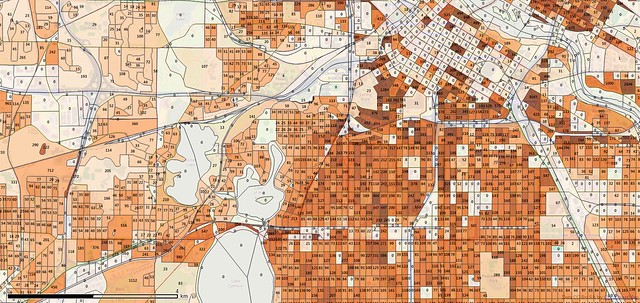
It can also be important to show where the boundaries of each region of population are. In sprawling suburbs, the data you try to use in order to make decisions becomes much more sparse. Individual blocks are larger, sometimes huge. Public streets are few and far between, with individual properties connected and yet separated by private drives and parking lots, and bounded by landscaping features such as ditches, creeks, ponds, bushes, and trees.

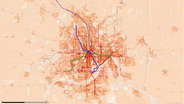
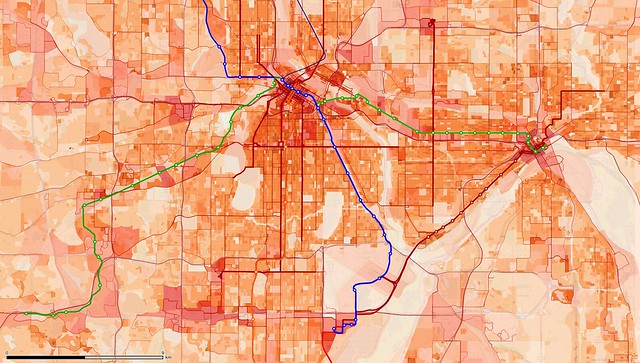
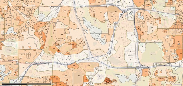
So, overlaying employment data can help. Unfortunately, it usually isn't available at very good resolution. For my first and third map in this post, I used Transportation Analysis Zone employment information from the MetroGIS DataFinder service overlaid on top of block-level population data from the U.S. Census Bureau. The second and fourth map only show population data (population count per block as a number, density for the color). All of the maps were created using the open-source tool, QGIS. The first and third map also include bus lines and proposed transit corridors (LRT for Blue and Green Lines, and BRT for the Red and Orange Lines).
Frustratingly, a number of corridors were not included because of a lack of easily-accessible data. The Gateway Corridor is still being nailed down, and was not represented in the DataFinder shapefiles. Even the Bottineau corridor wasn't included, so I added that. "Arterial BRT" and potential streetcar corridors weren't included either, though I did add station objects along Route 54 which is the highest-frequency limited-stop bus route in the Metro Transit system. Other "HiFrequency" lines are shown solid, because they have stops every 1-2 blocks in most cases. The precise routing and stop locations for planned routes are also in flux, so these maps will need to be revisited.
Each TAZ is usually composed of multiple census blocks, so overlaying the two can have some strange effects (I believe the appearance of heavy density northeast of University and Snelling is largely due to employment at the Griggs-Midway building by Fairview melding into an area that's mostly residential, for instance). There also seems to be missing data in a few cases, particularly on the employment side (the University of Minnesota has a lot of employees, though the East Bank campus is seemingly empty). The maps are not the One True Way to see the world.

Still, it's pretty remarkable that we're currently planning to build LRT out to an area with population dispersed like we see above, and with such a sparse street network, when projects to connect denser areas get discarded or downgraded. The number of people per census block is actually relatively high in Eden Prairie, often measured in the hundreds, but it's difficult to move around in the area because of such a stingy layout of roadways, often lacking sidewalks (this map is at the same scale as the second one in this post which focused on south Minneapolis). Looking at aerial photos, the region seems to be bustling with activity, but a lot of that is due to low-slung office and retail buildings with massive parking lots. All the asphalt makes it look more built-up than it is.
The city also has a big employment base—more people work in Eden Prairie than live there. But despite that large number of workers, the employment density isn't all that high. There may be some missing data from employers who declined to submit per-site numbers, but it appears we'd have a much better return if we looked at improving the situation along the I-494 strip and the France Ave/York Ave corridor in Bloomington, Edina, and Richfield, for instance.
But looking at our existing Hiawatha Line seems to show that rules that you think are important can be broken and still result in something that gets broad appeal: There's very little residential density along the east side of Hiawatha Avenue, because it has been and continues to be used as a freight rail corridor for industry (mostly grain traffic). The airport and Mall of America are also critical to the line's success, but they're in areas which are otherwise pretty empty. The Central Corridor also neighbors large areas without any residential use—though that line tends to skip over the "empty" space while other routes seem to skip the populated areas.
The region is certainly running an interesting set of experiments with these routes, as well as some of the others that I couldn't get to. Which ones will turn out the best?
Are there good opportunities for inflill along Central LRT?
ReplyDeleteAlso, as a fellow QGIS user I think your maps might be the advertisement for it I’ve ever seen—really superb work.
Yeah, there are a vast areas of parking along the corridor, along with many low-slung structures that could be replaced with ones of greater height/density. There was a fight a few years back about how the zoning would change along the corridor, which was looking really good for a while (such as parking minimums being eliminated near stations). The end result was a bit underwhelming, but hopefully it will get revisited in the coming years.
DeleteAnd thanks for the comment on the maps! I appreciate it.